![]()
The New And Improved
Visual Builder Interface
The Visual Builder interface has been updated with a fluid and responsive design that improves the building experience on mobile devices and large monitors.
The power of Divi lies in the usability, flexibility and customizability of the Visual Builder. It’s not just about what the builder can do, but how easy and enjoyable it is to get those things done as a designer. Today we are making the builder even more flexible by extending the fluidity of its interface and improving support for for mobile devices, large screen sizes and vertical monitors.
Test Out The New Fluid & Responsive Builder
![]()
A Fluid & Responsive Interface
With Improved Mobile Editing Support
Editing your pages on smartphones and tablets is now a lot easier thanks to the builder’s new responsive design.
Built For Small Screens
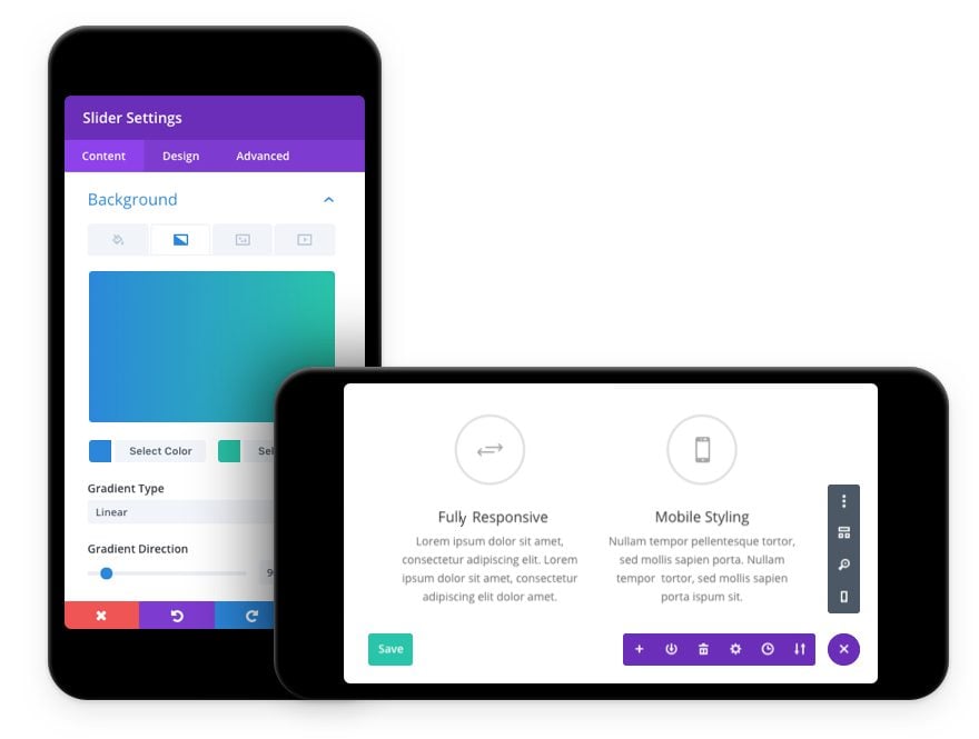
The Visual Builder interface has been optimized for small screen sizes and mobile devices, improving the experience when editing a website on your smartphone or tablet. Interface elements will no longer become crowded and overlap each other and the builder will automatically adapt as the available screen space becomes smaller. If you need to make a quick change to your page, it’s now possible to make those adjustments while sitting on your couch with your iPad. We are still working to improve mobile editing overall, and to add support for things like drag & drop, but today’s update is a great starting point.
![]()
Improved Support For Large
Screens And Vertical Monitors
The building experience has been improved for large monitors too, enhancing the way interface elements can be expanded, snapped and arranged on your screen.
Three Column Option Expansion
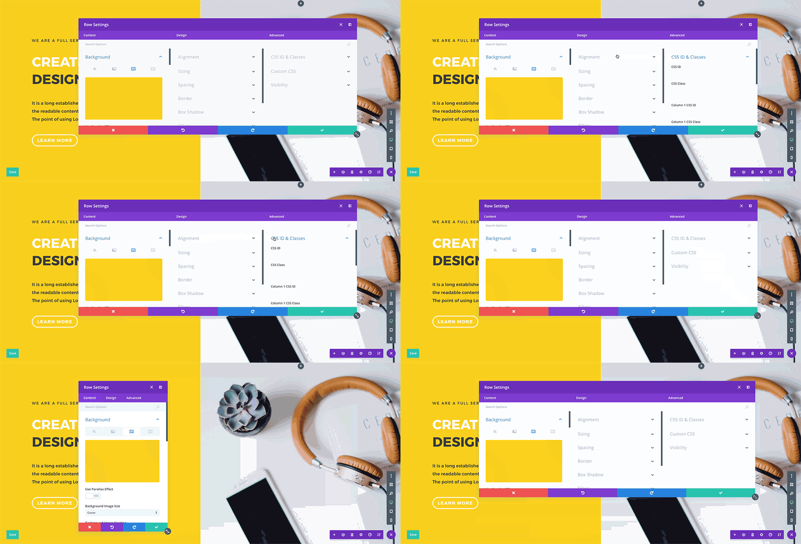
In addition to improving support for mobile devices, we also optimized the Visual Builder interface for larger screens. When you extend the width of a settings window on a large monitor, all three option tabs will be revealed in a new three-column layout. This makes it easy to quickly access every option group. If you have the screen real estate to support it, this mode can save you time and reduce clicks.
New Modal Snapping Locations
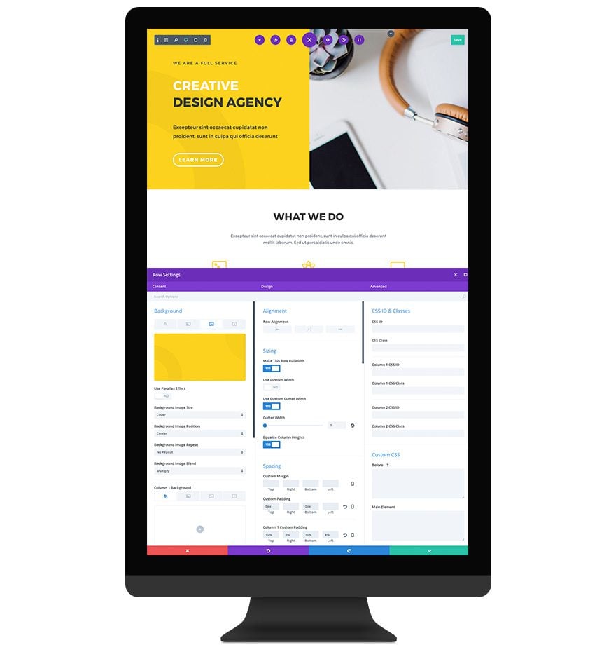
We also added the ability to snap settings windows to the bottom of the screen. This, combined with the new three-column settings window makes for the perfect editing experience when used with a vertical monitor. In fact, this is probably the best way to design with Divi period! You get a full un-obstructed view of your page while at the same time being able to access every settings tab. Plus, when you have your settings window snapped to the bottom of the page it doesn’t reduce the width of your content and squish your design. Flip your monitor on its side and give it a try 🙂
New Settings Bar Snapping Locations
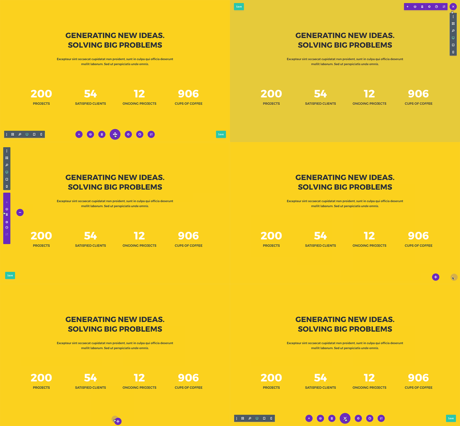
We added more flexibility to the settings bar as well, which can now be snapped to various new locations including all for sides and all four corners of the screen. There are some great advantages to placing your settings bar on the side of your screen or in the corners of your screen since it will never overlap your page content or disrupt your editing experience. Just drag and drop the bar to your favorite location and Divi will remember your preference.
The new and improved Visual Builder interface is available today, so download Divi and take it for a spin. Let us know what you think in the comments and don’t forget to check back next week for even more great Divi features coming your way!
Get 10% Off Today!
Today's The Best Day To Get Divi Or Upgrade Your Account To Lifetime
Join the most enthusiastic and loving WordPress theme community on the web and download Divi today. Using the new Visual Builder, you can build websites faster than ever before with its incredibly fast and intuitive visual interface. You have to see it to believe it!
Join Today For 10% OFF!Renew Your Account Today For 10% OFF!Upgrade Your Account Today For 10% OFF!




Awesome! I was waiting for this. Editing my sites everywhere on an iPhone or iPad. You’ll change my life! 🙂 Thank you.
Well hopefully it’s an improvement, i see the divi builder really struggles to perform generally on pages where you are using say flex layouts of css grid.
I think you need to pay more attention to fixing bugs with the actual theme, every time i open modules they’re full of weird things like a bunch of that weren’t added by me, then there’s settings in the modules that have messed up layouts, there are issues in the theme options, try removing the | in the seo section of theme options lol. And then there’s modules set to global that, when you update, don’t update across the whole site. And more, sadly. List is endless lol. But it suits me for now i guess.
Hey Nick, it would be useful if you included the release notes to the post as well (somewhere below the post). Right now the only way I know to get them is to download the theme, unzip it and open in a text editor. I am referring to the notes in the ‘changelog’ file.
https://www.elegantthemes.com/api/changelog/divi.txt
I am continually in awe of what you guys produce. I don’t think I’d go anywhere else for what I need for the web.
Awesome. Now, for the sake of our sanity, I have a suggestion / request. When you post a “theme release” article like this one PLEASE provide a link to the change log and disclose the Theme update Version# !!! I don’t feel like
Excellent job!!
I definately find Divi very intuitive to use. Having recently experienced working in the WPBakery Page Builder I cannot wait to test out these new work-flow options.
Keep up the great work!
I’ve never even tried using the Visual Builder on a smartphone or tablet, but I really like the updates for larger screens. Very thoughtful and much appreciated. 🙂
I would love it if there was an option on the ET blog to receive an email notifying me that someone replied to my comment. Also an option to subscribe to comments on the ET blog would go hand in hand with this.
How many questions have I asked in the comments section of the ET blog and never knew if there was ever a response?
I check back every now and then and then forget which post was which. 🙁 A VERY simple thing to add that would really help out your customers whose primary source of ET info is the ET blog.
Thanks!
Deb
+1
This is a very annoying situation and one that seems TOTALLY fixable. Yet, nothing happens.
This is great thanks but when are we going to get the option to edit the footer credits in the Extra theme customizer the same as we can do with Divi?
Nothing on speed and optimization front. So bad ET team! By looking at comments i see developer folks are excited but not we non dev folks. Do something for optimizing your theme. i have already moved my websites to other properly optimized theme. The way google is stressing on it everyone soon will then will remain you and you cheerleading dev folks.
Hey,
We released a big performance enhancement update back in August which improves the Google PageSpeed scores and reduces requests and file sizes. Since the release of this update, we have introduced various other performance related improvements and optimizations and we will continue to do so. You can check the full changelog in the member’s area to see all the changes.
In general, the majority of your page load performance depends on the quality of your hosting plan, your site’s content, and the optimizations you have in place (caching, CDN, etc).
The following articles from our blog should be helpful:
http://www.elegantthemes.com/blog/resources/dramatically-improve-your-wordpress-loading-speeds
https://www.elegantthemes.com/blog/tips-tricks/how-to-improve-your-google-page-speed-score
Not related to this post – DIVI is still very limited to the shopping module – and waiting for the improvements in that, like so many other theme providers already giving so much options. Also hope that in 2018, we will be able to make apps with WP using DIVI.
New Features The Divi’s Responsive & Fluid Visual Builder Interface With Improved Support for Mobile Devices and Large Monitors is great, but the desktop interface is not like its predecessor it’s uneven and difficult to customize. Customize the desktop interface.I see the interface for the desktop is not the same as before I hope you can separate the Desktop and mobile interface to separate.do not hard drive before you can see my hy vọng you will dividers desktop and mobile to 2 different versions.When viewed on the dektop, the interface as before is here on mobile, the new interface if you gather as this new version is a bit difficult to see the desktop version is not the same as before.
Wow! I think you made something incredible, more incredible… you must be recognized like one of the best wp products…
But I am still waiting for whatsapp share! 🙁 (mobile feature)
+1
Awesome and very useful update 🙂
Good things come to those who wait!
I wait and good things come 🙂
Please can we wait for a “back to the top button” at the bottom of the blog!
Hi Liz,
You can enable this by going to Divi > Theme Options and scroll down to the “Back To Top Button” option and enable it. ?
I got an offer to renew my account with a 10% discount. The problem is I cannot find any place to renew. The link in the email takes me to a screen with buttons to join, renew, or upgrade. When I click the renew button it just takes me to the Members Area screen. I checked every link on the screen (including the hamburger menu in the corner) and there is no place to renew. I can find where to upgrade to Lifetime Membership.
Hi John,
Sorry for the trouble! Please open a chat with the sales team by clicking on the bottom right floating icon and we will be happy to assist you. ?
Great improvements, Nick! Is there any chance to bring to Divi Contact Form module attachements?
Excellent. When it’s ET doing something for the Menu using the Divi Builder, you know, header customization, menu 1, menu 2, footer; animations to menu, etc.
Hey,
Thank you!
We do have future plans for better header customization controls. Stay tuned! ?
+1
Lovely improvements on a high level so far anyway. Thank you for keep on pushing limits guys! The dynamic, vertical and snapping features are helpful to me in means of time efficiency at work and thus a benefit for my clients (because in the time saved, I could experiment on improving site aspects for the well for my client – charging as zero invoice ;)). Thank you.
Awesome! Thank you very much Nick!
Great improvement..thanks
I would like to suggest a color picker for future updates. 😀
+1
Awesome!!!!
This is one of many features that i loved in divi…
Great Jobs……thumbs up 3x….
You keep my enthusiasm grow even after 3 years of lifetime subscription you are the best choice for WordPress themes and keep forwarding knowledge to all of us tha really need a professional hint.
Simply my regards for your excellent work.
Browser Puffin pro, mouse simulated, Puffin browser pro, which simulates the mouse, pity was the reason (use it on ipad pro) that Divi builder had me choose instead of Beaver builder
I must say, however, that up to two releases ago, you could work on ipad pro safely with the visual browser, now from problems, need the mouse, others, and does not allow you to click on the options (gear wheel) and I am forced to use the
I have been using Divi for almost 2 years, and I think it is great, but I would love to see improvements in other areas -like the integration of Google reCaptcha into the form module. Now I have to use Contact Form 7 to integrate it, and that’s not the point…
I agree with an earlier comment about breakpoints – not always being optimal. Considering the diversity of devices it is probably as good as possible.
Nick and all the Divi-boys en girls, you make me very happy ???
Hi Divi people, love the stuff you do for Divi but have to totally agree with Tony Scott, nearly impossible to quickly download anything from a members point of view.
And I’m now a Lifetime member.
Tony’ side of a separate logon button makes a lot of sense to me.
Cheers
Chris
Dear Nick and team,
Thanks for your continuous work on Divi!
Anyone else think the music sounds like I Sir Mix-A-Lot’s “I like big butts”?
Sweet! Can the back end Divi editor be optimized to open and load faster?
Not only that, but I would love to see the windows get the same treatment (collapsed/accordeon-style settings) as they have in the visual builder. I use the back end builder 99% of the time, so seeing improvements there would be very nice.
Also, while I’m at it: make the selective sync more robust please. I use it heavily on a couple sites, but always have to double-check the settings are correct before saving changes to ensure they won’t mess up all other pages that use the same layouts, and even then they’re often not working correctly — mostly the “enable/disable on” settings within the section/row/module, while they do work from the right-click menu, but there you can’t set or check the sync setting.
Again Elegant Theme rocks !
I have a suggestion. I’d love the module window to open in a real pop up window that I could drag outside of the browser on my second extended PC screen
This has been said so many times already and still nothing has been done.
The ET website is an ongoing source of frustration for many lifetime users. It is incredibly ironic that ET’s own website is a nightmare to navigate and a shining example of bad web design. We are all fed up to the back teeth with the JOIN TO DOWNLOAD button flashing at us.
Why are paid members being prompted to “JOIN TO DOWNLOAD” with a big offensive button AFTER they have logged in. How is it that ET is not capable of recognising when users have logged in and REMOVING the “JOIN TO DOWNLOAD” button? We are all fed up to the back teeth with the JOIN TO DOWNLOAD button flashing at us.
And right next to that big horrible button is another misleading link on the navigation menu – “Login”. But I have already logged in!
I, and others, have mentioned this several times in the past to ET yet it remains the same – we are still prompted to Join even though we are members, and still being prompted to log in after logging in.
The weekly layout packs that are free for all users can not be found anywhere on the website. Why not? It would be so simple to add a link to LIfetime members’ account page.
Add a menu item for the Lifetime Members Only and give us the access we have all paid for.
+1
I agree – it is VERY annoying
Good point, Tony!
Hi Tony,
Sorry for the frustration.
The main website is heavily cached and that is the reason why the login button is still showing up in the header. However, if you are logged in, clicking the button will redirect you to the main members area page where you can access the downloads without taking any kind of extra action.
Regarding the weekly layout packs, they will all eventually be available in Divi with the Divi Library update which is going to be released very soon. With this update, you will be able to load the layouts from your website directly without having to download any file separately. ?
I agree, it’s always been a total pain, and I actually don’t even bother logging in anymore unless I really need to.
I just put a dummy email addy in the “click here to download” box just to save getting re-directed if I do login, of which then I usually can’t find the original article again to download.
I cannot use the Visual builder, having ADSL1 internet still. It’s just too slow and clunky. No doubt it’s great on fibre connections.
I also find the VB still doesn’t truly represent what you’ll see on the finished page … thus even using the VB I’m checking the “real” layout in another tab/browser.
And the “tablet being same as a PC” is frustrating and still requires media queries in my child css.
But, DIVI is still the best and easiest Page builder, making it our favourite for clients who want to do their own editing.
Happy New Year to you all …
“I also find the VB still doesn’t truly represent what you’ll see on the finished page … thus even using the VB I’m checking the “real” layout in another tab/browser.”
And I thought it was me – the VB does not represent accurately the final page so why people are so enthusiatic about it beats me!
CUSTOMER CENTRIC = Divi @ Elegant Themes
Thank you.
Looking forward when it works on iPads.
Just tried it on my iPad Pro but right now I can’t edit text on any of my iPads.
Is there a workaround or do I have to be patient?
Love DIVI anyway!
Hi Karsten,
Sorry about that!
I tried it out on an iPad Pro with iOS 10.3 and text editing appears to be working on my end. If you didn’t already, please open a ticket in our support forum and we will be happy to take a closer look.
Thank you! ?
Me too! Love Divi, but if I can’t edit content on my iPad Pro 10.5 then it doesn’t matter how well the design aspects of Divi work, I can’t use them on most of my pages. Can you please fix this, and advise?
Hey Gary,
I’m sorry for the trouble. We are looking into this as we speak, however, so far we were unable to replicate any issues with editing text on iPad devices that we tested.
It would be helpful if you can open a ticket in our forum so we can take a closer look. It may only be replicable in certain situations.
Thank you for your cooperation! ?
Awesome! I really appreciate how the Divi builder just keeps getting better. Keep up the great work!
Having two monitors, would be great to be able to detach the options panel as most design tools allow.
Maybe for the next release?
Good job anyway!
That is exactly what I was thinking! I turned my screen as suggested and my mouse didn’t know what I had done. I’m sure I’d have to recalibrate or something. 🙂 Keep up the good work!
Okay 2018 is going to be great I tell ya…This has got to be one of your best most bestest updates Divi…Happy New Year and thanks…Keep up the good work.
Finally the time has come …….. A wonderful job. Thank you guys
Brilliant new features!
Thank You Divi Team
Looks really good, can’t wait to use it, believe it or not, I do not use the visual builder as much as most Divi users, maybe I should give it a try.
Give it a go.
It can be disconcerting at first, for some users, but after using it for more than a year now, it is second nature to me.
I have worked with other page builders out there and they vary from being horrendous to being not bad at all. There are some things that other builders do better, but Divi, for me at the moment, has the edge overall.
The vertical feature is nice, but how does displaying 1920px wide images work? It will be difficult to determine crop points because the screen will effectively have a new breakpoint when designing.
Great feature update…
Would not mind seeing an article on what is supposed to be on tap for 2018 from ET.
Columns update… I really want that columns update you say is coming…
Hi Nick,
As a total non-techie I feel the beginning of the new year is a great moment to share my enthusiasm and express my gratitude for the great work you guys continue to do with Divi, I love love love it! Keep up the great work!
Hey Guys,
Love the new update!
Still have an issue with the visual builder though: the options sometimes overlays the text making it tricky to edit.
https://ibb.co/hEod6b
Have any idea how to fix it ?
Thanks !!
I have had that issue as well so I just go into edit mode not visual builder.
Cheers,
Vickie
Hey Rostane,
Sorry for the trouble!
The row controls should appear above the row. I tried to replicate it with different module setups and the row controls always appear above the row (as they should), even if there is no top padding set on the row.
Please open a ticket in our support forum and we will be happy to take a closer look.
Thank you! ?
This frustrates me a little too.
Another fabulous update guys – congrats to Nick and team 🙂
Would love to see media query support in the custom css section. Even if you can’t specify viewport widths and there’s just 3 sections for desktop | tablet | mobile etc that would be a handy feature
@ James, that would certain be heaven on earth right there…Happy New Year fellow Divite!
Is there any sneak peak of Divi 4.0 coming our way?
Great update, congratulations!
That may or may not exists yet. I’m just egging them on as a hard task master ; )
Impressive bit of work.
I’ll pre-empt the moaners by adding that this should now be seen as the final stages just before we see:
* The release of Divi 4 that will do everything including cooking my dinner tonight?
* More advanced settings for the header elements ala the Flatsome theme?
* Responsive images everywhere, even the ones in the art galleries I visit?
* Better integration with custom post types in terms of the visual builder recognising them as
truly fullwidth to the browser window without the need to hack in a bunch of boiler plate css in
my Divi Child theme.
Anyway no pressure. Just some jobs for 2018 : )
Just an addition.
I have already posted, a while ago, on the feature request pages, for the possibility for the controls in the divi builder to open in a separate window, like how the inspector in Chrome can be configured. It would be really appreciated by those of us who have more then one monitor.
Just updated a test site for a test run and am truly impressed. I will look again tomorrow because unfortunately Divi 4 isn’t out yet and I have to make my own dinner.
Actually, the vegetarian dinner-maker is included in this update. Omnivores will have to wait for Divi 4.
As always, Elegant Themes team innovation that goes far, far away.
I like it, but i wate for mor options to style the menü
Good work guys.
nice, but when will you add the option to upload a file in the contact form?? i really need it and i dont want to install a new contact form plugin just for that, besides i would have to redo all the existing contact forms
i like this Visual Builder Interface
Thank you very much Nick!
Sure is a big improvement. I aprecciate a lot your efforts to make this visual builder an excellent tool for designing web pages easily.
Saludos,
Gaby
Great improvement!
Would be *PERFECT* if there’s an option to set the viewport at specific size (1920×1080, for example) leaving space at left or right for the options panels.
For those, like me, with Ultrawide monitor (2560×1080) or dual-screen this would be very useful!
Awesome! This was definitely something that was needed. I would always struggle with the window being either too big or too small and nowhere to put it out of the way. Thanks for this huge update Nick & Team.
Excellent improvement Nick, I had this discussion with my clients whom I build websites for, This area of improving is very smart.
All the BEST to you and to DIVI TEAM.
Happy New Year
George
Construction Online
YES!!! So excited to see that the Visual Builder can now be used on mobile devices.
Divi is the best – here at FeedbackWRENCH Minneapolis Web Design and SEO – we’ve benefited a great deal from all that you do. Seriously, I’m not just sucking up here – your wordpress theme is LIGHTYEARS beyond any of the others….. the Total theme, X theme, Avada, and even the Genesis… I love what you guys do.
I think my favorite part of using this tool for our agency is that you’re continuing to make investments back into the product – in a masterful way. It’s not that you’re adding gimmicks to things, it’s that you’re genuinely making our client’s websites better AND our ability to provide amazing web design services.
Thank you for what you do.
One thing I wish – is that it was easier to put medium, small, and large (non full) images in pages. I often find myself opening another window to find the URL’s of the other versions of our images to put into posts in order to reduce file size and improve our Google pagespeed. Are we missing something there?
Thanks for everything!
I concur with the first points here. Considering how the controls have been redesigned for the different ways people work on different devices shows an attention to detail and will make me reassess how this may affect my workflow.
I understand the impatience some of us have for the features we would like but I guess Rome wasn’t built in a day.
At first I thought it was the anticipated update for [actual] mobile device screen sizes. Quite disappointing. That one guy with the ipad might like this update.
+1 for this. I always struggle with a design for viewing on iPad in portrait mode because it has a different breakpoint then the one that’s used for the Divi tablet setting. Quite strange that it doesn’t follow the screen size of the most used tablet.
On the other hand, I like that a website on iPad landscape looks just the same as on a desktop/laptop.
I initially thought the same thing. The viewport breakpoints don’t always quiet equate to real devices and tablet seems to be considered the same as desktop. The only thing that I can deduce is that ET don’t want too many options that may confuse some users. For the rest of us that like to hack, for me anyway, we always have a child theme to manually do media queries for refined work on the various viewport sizes.
I would like to hear what the ET design’s teams thinking is on this, in the blog perhaps.
This is dope!
I hear it’s legal now in their part of the world.
Cool! Keep up the good work Elegant Themes.
Great work! This was a much needed improvement.
Hi Nick!
I know it’s not for the article, but I’m interested in making GIF files.
Thank you, Nick and team! It is the well-thought-out enhancements like these in the everyday workflow that really make Divi a joy to use. Thank you for your work!
Wonderful feature addedd… Let’s explore.
Amazing!!! Great work.
Great! Awesome improvements!
Awesome!!!!
Love you, guys!
Hi team Elegantthemes, You guys are awesome at development.It is amazing how you people are creative on continual basis.
Thank you so much.