
Improved Options Organization
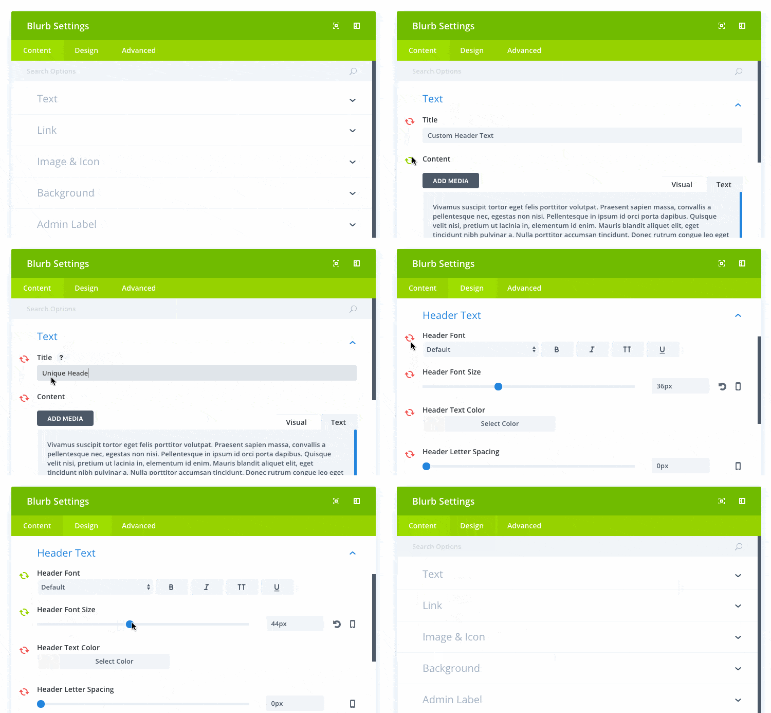
Every Divi Builder option has been re-organized and similar options have been grouped together into easily-browsable categories.
Today we are releasing what has to be my favorite new Divi feature of the year. It’s my favorite new feature because I know what a huge impact it’s going to have on your productivity, and I love releasing updates that improve efficiency and make Divi and easier and more enjoyable tool to use.
Divi has had a long journey and with each evolution the builder has become more robust and rich with features. Every time we added new module option, however, the options tabs became just a bit more cluttered. For those just starting out with Divi, finding a desired module setting could take some time. It was often unclear if the setting existed, and if it did, under which tab the option could be found. Within each tab, the long list of unorganized options were difficult to sift through.
We have tackled this problem from several different angles. First of all, every Divi option has been grouped into categories. Like-options have been combined into sub-groups within each of the three Divi options tabs. The three Divi options tabs have been re-named to allow for a clearer distinction between each tab, and all modules option groups have been moved around accordingly. These option groups have been organized with an understandable hierarchy, as have the options within each group. Finally, we have made the options searchable (and it’s really cool)!
Introducing Option Groups
All module options have been grouped together into sections within each Divi settings tab. When browsing a list of options, finding your desired setting is so much easier. Every module has similar groups, which means when you open up a new module for the first time, it’s pretty clear where to find what you are looking for.
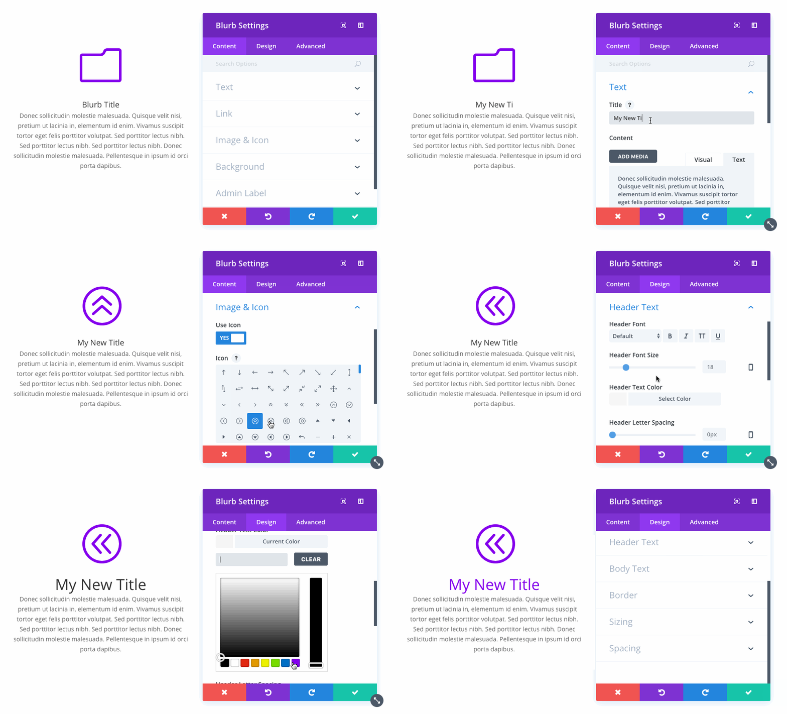
These groups are especially useful for the Visual Builder where we have turned option groups into toggles. This consolidates space and allows you to use a small settings modal that does not obstruct your view of the page. You no longer need to scroll through long lists of options because all option groups are visible even when your settings modal has been reduced to a very small size. Just navigate to you desired tab, open up your desired options group and start editing!
Better Option Organization
Not only have we grouped options together, we have also re-organized them. When you open up a settings tab, the groups of options you see are ordered in a way that makes sense (crazy, right?). Groups of text options follow each other in the list and adhere to a basic sense of hierarchy. When you open up a group of settings, the list of options have also been re-ordered. Settings that are often used together will show up next to each other in the list. It’s a simple change, but it makes a huge difference.
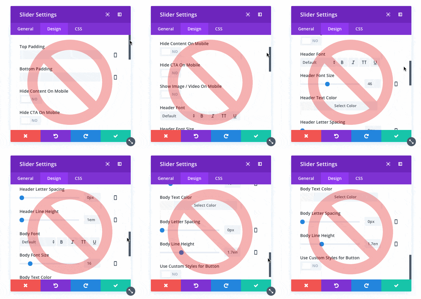
The New Options Tabs
We have re-named the three basic Divi settings tabs and all options have been moved around accordingly. In the past, all Divi module settings modals had three basic tabs: Basic, Advanced Design and Custom CSS. These option tabs were born from Divi’s natural progression over the years. The distinction between “General” settings and “Advanced Design” settings, however, became arbitrary as time progressed. The distinction was based more off of Divi’s history than it was off any objective difference between the settings in each tab. For new users, it really didn’t make as much sense as it should have.
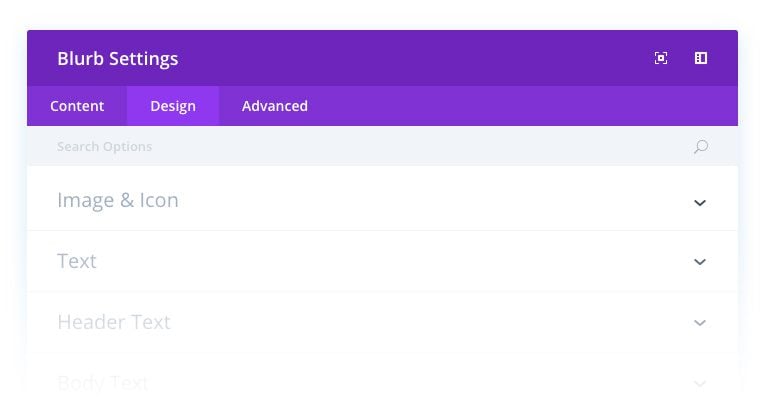
Today we are introducing three new tabs: Content, Design and Advanced. Within the content tab, you will find all of your text, image, video and module elements (such as: Header Text, Content Text, Slider Image, Blurb Icon, etc). Within the Design tab, you will find all of your design settings (colors, fonts, sizing, and spacing). In the Advanced tab, you will find options that will be useful for advanced users with web design experience (such as Custom CSS, CSS Classes and HTML Attributes).
The idea is simple. When you open up a tab of settings and locate a settings group, it should be clear what you are going to find inside that group before you open it. Not only does it make browsing Divi’s current settings easier, it also means that we can continue to add lots of new module options without cluttering the interface. And guess what? We have a lot of new module options on the way!

Search Options And
Get Instant Results
All module options are now searchable in the Visual Builder. If you know what option you are looking for, just open up the settings modal and start typing! Divi will find the setting for you.
In the Visual Builder, all Divi module options are now searchable. When you search through options, the results appear instantly! This is such an amazing feature that once you start using it, you will find it hard to believe how you ever lived without it. I can’t stress enough how much this will help boost productivity once you get used to using it.
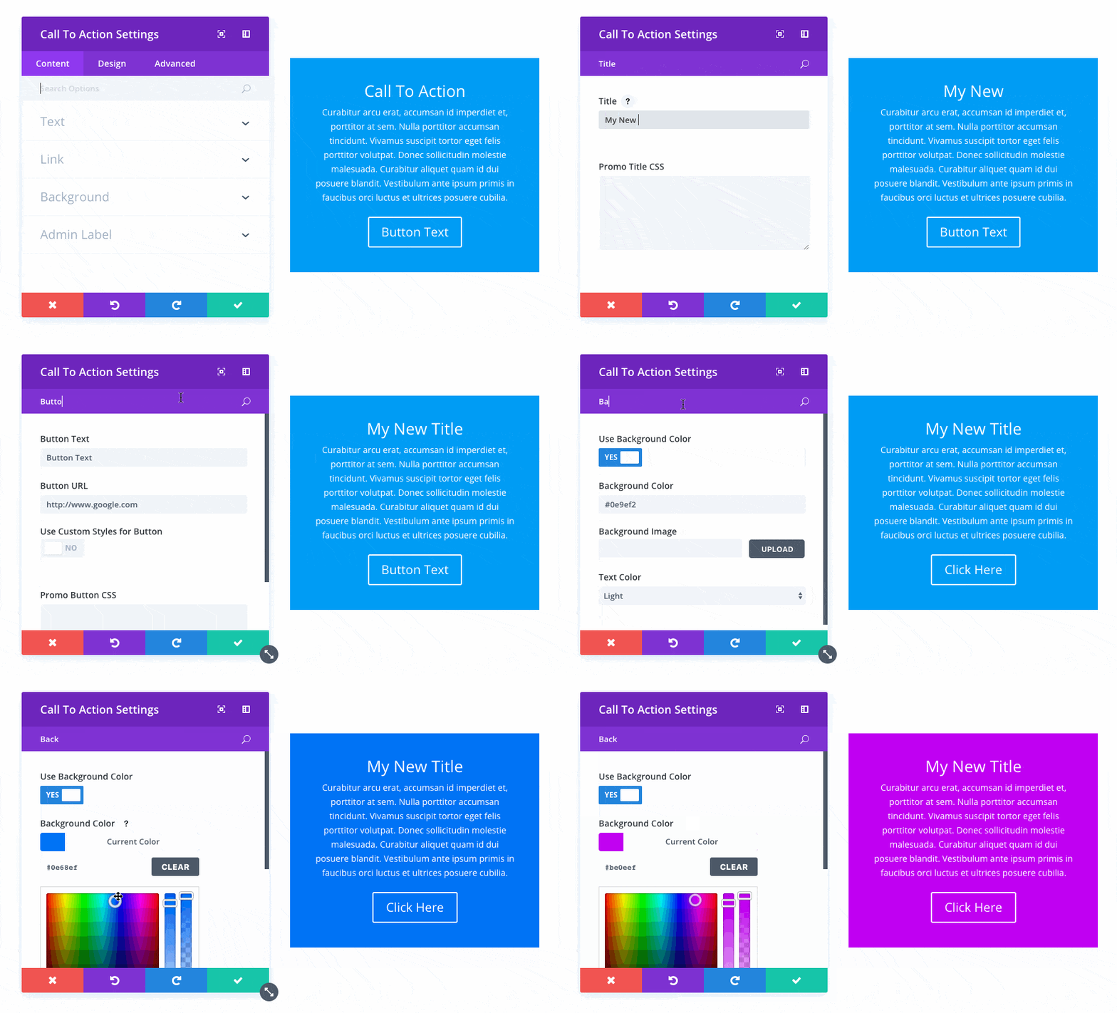
Once you search for an option, Divi display a list of relevant settings and you can modify your option right from the list of search results. If you know what you want to change, just typing in a few letters will bring you to your desired option even faster than clicking through the newly-organized settings tabs.

The New Selective Sync
System For Global Modules
The new and improved Selective Sync system for Global Modules allows you to sync and un-sync individual settings.
Selective Sync is one of Divi’s hidden gems. It allows you to create global modules that you can place on multiple pages on your site while only syncing certain module settings to each page. For example, you could create a global Fullwidth Header module that you place on every single page on your site. Through Selective Sync, you can mirror the design settings across every page while at the same time keeping the module’s content elements un-synced (such as the Header text). This allows you to have unique content on every page, but keep all of the module’s design elements synced up. When you make a design change to the global module, that change is reflected on every page while your Header text stays unique!
In the past, Divi let you selectively-sync any of the three settings tabs (General, Design and CSS) at once. This was great, however, it did not give you full control.
Selective Sync For All Options
Today we are introducing a brand new Selective Sync system that allows you to sync and un-sync individual settings for every global module you create. This is now a standard feature of all global modules, which means the old selective sync options have been retired. You can now selectively sync any combination of settings, which makes Divi global modules incredibly powerful!
Get 10% Off Today!
Today's The Best Day To Get Divi Or Upgrade Your Account To Lifetime
Join the most enthusiastic and loving WordPress theme community on the web and download Divi today. Using the new Visual Builder, you can build websites faster than ever before with its incredibly fast and intuitive visual interface. You have to see it to believe it!
Join Today For 10% OFF!Renew Your Account Today For 10% OFF!Upgrade Your Account Today For 10% OFF!



Whilst I can see that this is an improvement moving forward, it has had a big impact on a client site, and it’s only after fixing the site, and then reading this post, that I realise what has caused it, and that I could have fixed it quicker if i’d read this first.
We had a global image module, width of site at the top of 90% of about 50 pages, and we were using selective sync for only the Design/Advanced tabs so we could change the image on each page.
We only noticed this week that all the pages were showing the same image, and that the global image module now has all three tabs (Content/Design/Advanced) in green.
Has anyone else experienced such a mess?
What version of Divi/DiviBuilder was this introduced with, as we are currently Divi v3.0.47 and DiviBuilder v2.0.9 ?
would be awesome to add more jquery features such as this –> https://codepen.io/EvyatarDa/pen/waKXMd for navigation. Looking forward to these features here in DIVI. 🙂
Awesome job Nick.
I love the new global settings. The new layout and search feature will save us a heap of time as well.
Great work! Selective Sync is a great function.
Thank you!
Really, really liking this new Options organization. My workflow has sped up considerably because of it. Thank you Nick and team!
Where are the image animations in 3.0.45 ? I need to change to no animation, but the option is missing.
I don’t get it – take two!
How is it that there is a ‘Make This Section Fullwidth’ option on a Full Width (purple) section?
I don’t get it!
How is it that the background colour is content, but the text colour is design?
Why re-invent the wheel that won you half a million paying customers?
Design should be replaced with Style and all colours should be under Style not Content.
Most folks think in terms of Content and Style.
The problem is when style is content, like a background image/video?
Totally HATE HATE HATE the new Divi!
Hello,
i have the Divi builder in a Theme from Elegant and after the Update i have
HTTP ERROR 500 .
Uwe
When does this come out? I’ve just updated Divi and can’t see these new features.
It’s live (3.0.45), but only in Visual Builder.
Aha…when in doubt, clear cache! All fine now 🙂
I’m using Visual Builder, but don’t have new features!
In the ‘back-end’ builder, I can see new headings in blue, but these don’t collapse as in the blog post and there is no search facility
Quick review:
I’ve just tried update and Selective Sync works fine for individual blurb. But if I create a global row containing 3 blurbs, these individual options disappears.
Love it. I’ve only been using Divi for a few months and always wondered about the organization of the options. This is great — and really love the global sync. I used it already to adjust some spacing — just a click to turn off the global and voila — I didn’t “crash” my other 5 pages that share the module. Sweet!
Hi,
I use Divi in my wordpress projects but you guys need to do options to customize the header, able ou disable features like project custom post type from menu and add typography hierarchic. I know that it’s simple with some code but it’s so boring.
THX.
Guuuys! Is there a way to switch options off ? Good Job, but not for me 🙁 Now I have to click in every single Tab to get an overview. New sync is great though!
Just wodering why the Design tab wasn’t called Style.
Don’t most designers think in terms of Content and Style?
I ran this update and I have lost most of my customizations on my Divi Child Theme. I see all the css is there but it does not function. I really would appreciate some help here as I dont know if it has anything to do with the update.
I need help please.
That is great news. Good work guys, you just made my life a lot easier.
Thanks
I’m getting tired of commenting “Impressive” all the time.
It’s time to pull out the thesaurus.
yes these divi features really work amazing ,i hope this will give me some boost in conversion as well.
Hi, i’ve updated the DIVI Theme, i couldn’t see what was explained.
http://prntscr.com/f6v11l
can you help me on it.
Me too! Updated Divi and can’t see these improvements.
Just Awesome.
Yay!!! Just yesterday I was thinking “man why don’t they organize these option better and under accordions, and have selective global elements…”. Keep it commin!
Love this update! I agree that this is one of the best updates of the year so far.
Is there somewhere I can see the changelog for Divi?
Adam,
– Log-in to ET
– on the left side menu select “Downloads” if not already selected
– scroll down to bottom of page and click large “View All Downloads” button
– scroll down to “Theme Downloads” and you’ll see Divi at the top of that list along with the changelog button on the far right of that row.
PLEASE ET, add changelogs to the themes/plugins pages in WP Admin so we don’t always have to log into ET whenever there’s an update!
thanks so much Nick, love it!
Divi already deserves an award! Nick make programming feel like magic!
Congrats!
p.s. Monarch needs whatsapp sharing XD
+1
Wow! Divi is just getting better with time. Ever since I got introduced to Divi I never looked back. I thought I was a die-hard Thesis Framework user but Divi won me over very quickly…
I love you guys. I have bought developer licenses for other themes and
their support went from lifetime to yearly. That made me choose not to
use them at all after spending a lot of money. Elegant Themes rocks
and is such a great investment. Love Divi and my clients love what I have
done to their websites, when I convert them to Divi. Keep up the great work
can’t wait to try the new update. Hugs
These look really impressive – it would be great to have the function to
1. Set slider height in module with custom css
2. Have different header options
3. Image overlay text options on hover
This is great stuff. Like how your team is always working to streamline and make things more efficient. Good job. Please add more social icon options. Such as Yelp and other major ones that are missing.
Love this update and the wireframe update just a few days ago. Appreciate you focusing on Divi and making it better for everyone. Keep up the good work!
Wow I’m impressed! Keep on going with this features… BUT one serious question: When do you provide an API/documentation to write custom modules (and eventually how to extend existing with new custom fields)? I think it is crucial for agencies to create custom modules for their clients to reduce the need of writing too much manual CSS and HTML/CSS/Shortcodes to module bodies which the client cant maintain afterwards (after the hand-over). And it would strengten divis market position when its the base for a lot of new (cool) modules (maybe with module marketplace???). Other extension developer may also add then a “divi mode” to their extensions instead of just providing ugly shortcodes.
Not exactly about Divi, but will you add non-optin ability to Bloom?(or Divi builder)
I would like to show notifications that is not optin form.
i.e. just a advertisement.
So I’ve updated to 3.0.45 and I do see the new tabs (content, design, advanced). However I don’t see the search option, the option sections have labels but they cannot be closed/opened and I don’t see the selective sync arrows on the global modules. Do I have to enable some options somehwere?
Thanks!
Toggles and options search are only available in the Visual Builder right now. We decided that having closed toggles best complimented the Visual Builder’s small settings modals, although we may update the Backend Builder if we get enough requests for it.
Backend Builder please. ASAP!
+1
I would also like to see both updated as I use both when working.
Count me in for Backend Builder too.
First, thanks for all the cool updates and your perfect work! I work mainly in the “Backend Divi Builder” for all our clients, so for me also this update will have a benefit, when it is also available there…
Please count me as a request for putting these changes in the backend builder. 🙂
Yes please add all features to the backend builder too. Seems odd that there would be feature disparity between different editing environments.
Although I haven’t used the new visual builder mode that resembles the backend builder. Maybe that would work, but entering the visual builder period is an extra unneeded step when you’re already in the admin and can just edit a post/page via the backend builder.
Count me in for Backend Builder too. Makes real sense.
Thanks, Nick, but doesn’t it need to be consistent throughout Divi to avoid confusion?
I agree I still find myself using both builders for developing so would be consistent to have in both ie cannot copy and paste modules from page to page with visual builder only with backend builder
Yes please! *vote for backend builder*
And if you need to maintain them separate (otherwise it would be already implemented) you should consider to remove the backend builder after some time and integrate the frontend-builder technology there instead. Will make creating custom modules also easier 😉
First – it’s great how Divi is evolving.
Second – it’s sad because I’ll be changing modules that I currently working on.
Third – Please, please etc. Do something that new modules created by users are editable in Visual Builder.
Last but not the least – it’s great tool (one of best) – but have some minor flaws: modules grouping, only one child slug for module (i want more). Separate javascript file bundle.js to two – if someone want to use only default wordpress editor and second for Visual Builder.
But after all i must say:[et_pb_text admin_label=”Text” background_layout=”light” text_orientation=”left” text_font=”Lato Light||||” text_font_size=”32″ text_text_color=”#880202″]It’s Well-invested money[/et_pb_text]
What about create custom setting for h1, h2, h3, h4, h5?
That is definetly a need!
@Nick, this is a much-needed feature, any update on this being released? Also, we need to ability to change whether a module is using an h1, h2, h3, etc. This will improve how SEO friendly Divi is out of the gate!
Absolutely agree with possibility to change Heading level for every module.
Many Divi updates make work easier&faster but we need new features which aren’t easy to do by custom CSS or plugin.
+ Vote for back-end features (changing Heading level, more Divi menu options, vertical tabs…)
Wow, great update, awesome 😀
Noticed that this searching feature is only available in the Visual Builder. Was that an oversight, or are there plans to add it to the back end as well?
And PS, a +1 for the comment that we need the ability to set the media breakpoints ourselves (it’d be even better if Divi allowed switching based on screen orientation too).
For now this is only available for the Visual Builder.
Thanks for your reply, but I am sure you are aware of how many developers strictly use the backend as they await a cleaner release of the Visual Builder.
Not sure why ET made this design decision, but I am sure you have your reasons. Nonetheless, I’d say that well over 50% of your users will not be able to take advantage of this feature until it is implemented in the back end.
I count myself in this group. The Visual Builder is fine for adjustments of things like padding, but I design 90% of the site in the backend…and would love to have this new feature.
+1
agree with Patrick, it used to be 70% backend builder and 30% visual builder , but now it is around the other way. So there is still definitely a need to be on both
You’re missing out Patrick! The Visual Builder has sped up my design workflow drastically. No more switching between tabs, or having to refresh the front end of the website after every minor change. I forced myself to use nothing but the Visual Builder for an entire client website build. It slowed me down a little bit as I was getting used to it. I’ve been using the backend builder since Divi was released, so I had a lot of habit. But it didn’t take me as long as expected to become very comfortable with it. And now I pretty much use the Visual Builder exclusively. If I ever find myself in the back end, I’m itching to get back to the Visual Builder, because now that I’m used to it, it’s SO much easier to design. There were a few things that were easier to do in the back end, but now that the “wireframe mode” was launched next week, I don’t think that will be the case anymore. And sure the VB had some bugs/glitches in the beginning, but 44 versions later, it’s pretty close to flawless. You should give it another shot 🙂
Fully agree. With the wireframe view along with the visual builder, the webpage design productivity has significantly increased.
I love Divi and use it almost exclusively for all my development work… BUT there is one big problem. I build membership sites with protected content and Divi’s Visual Builder will NOT work with my two favorite tools: iMember360 and ActiveMember360.
Is there anyway that I can convince your staff to reach out to the developers of this create content protection and CRM integration plugin for WordPress? They have THOUSANDS of sites running their plugins.
Contact Bob Keen of ResponseFlow at [email protected] or [email protected]
The two plugins integrate Infusionsoft and ActiveCampaign respectively with customer’s WordPress websites.
Wow, go to know! I was just about to start a project with activemember360 and Divi 🙁
Am I the only one just seeing this as more clicks? All stuff is behind one click more?
Yes I can see this as possibly slowing things down too, or getting in the way if you just need to scan for an option when you don’t know exactly where it is.
I haven’t used the new version yet, but hopefully there is an “Expand/Collapse All” option with an option to remember your setting. Or better yet, it would be great if Divi would remember your setting on a per section level. So whichever panels you expand would remain expanded the next time you opened the module settings.
+1
+1 – I like everything you’ve done here except that there should be an option in the Divi settings to expand none/fist/all by default. I really don’t like the extra clicks to get to the FIRST group of settings like the “CSS ID & Classes” which I use constantly.
+1
The extra click replaces the need to scroll, so it saves a lot of time actually. For example:
On The Old System:
1. Open the settings modal.
2. Click the Design tab.
3. Scroll down.
4. Scroll down.
5. Scroll down.
6. Modify setting.
On The New System:
1. 1. Open the settings modal.
2. Click the Design tab.
3. Click top open a group (it automatically scrolls down for you)
4. Modify setting.
Also, you can just search and skip all of that 🙂
Hi Nick. Please consider this option: editing Divi on tablet/landscape view.
Great thanks for your hard works!
Remik
Divi is really great, but… Can we espect croatian translation of Divi any time soon? It is already translated in serbian language, wich is practicly the same language as croatian (even there are some people who claim opposite). Best regards from Croatia! 🙂
Such a fantastic platform! I would’ve been completely satisfied with Divi when I started using it a few years ago. But with the constant updates, free layouts, & free snippets always coming in, it’s a no brainer to use Divi exclusively. Thanks & keep up the good work!
Divi is best wordpress theme. Pls add image instance like module in visual builder by default.
I created a business around DIVI and didn’t regret the choice I made. Each implementation these user experience just gets better..
Nice personal work! Keep it up!
Same here!
Divi is one of best wp theme ever. New featured makes awesome. I love Divi.
Divi is awesome. Pls increase no. Of module. Increase feature of contact form feature like date,dropdown, radio button, numbers etc and many more.
A customer recommended Divi around 12 months ago and now it’s the theme we use for almost every project. So much versatility!
Thank you Divi team for your continued updates. The reorganisation of options is bound to save hours in development.
Yes, there is no need to use anything else in my opinion. 🙂
Finally wait is over for one of my most favorite “Selective Sync For All Options”.
You rocks!!!
Like that you can search for an option. Not so sure on categorising them though. It was fine as it was I think – now you have extra unnecessary clicking.
What is the process to activate the update if already running DIVI 3.0? Will this be a PUSH to WordPress update area?
I just updated, and I’m not seeing those little arrows for selective sync. I tried saving an existing module as a global, and I tried creating a library module from scratch. First time I then used that library module from scratch, I didn’t set a background image or text. Inserted it once, set those fields. Inserted it again…and the new one got that image and text automatically. The update definitely went through–the option search is there. What am I missing?
I’m not seeing the selective sync options either.
I’m also not seeing the search option, and all the group settings are expanded. Clicking on a heading does not close the group.
This sounds like it might be a cache issue but, I cleared the sites cache, browser cache, and tried logging into an incognito browser instance with no resolution.
Ok I found out what it is. Entire sections don’t have selective sync, but modules do. So if you create a fullwidth section with a fullwidth header inside, you can only make the header that’s inside be global and have selective sync.
Wow! Great! I waited for a moment to make an organization there! Thank you!
If I turn the site over to the end user, I try to lock it down as much as I can to prevent someone who might be inexperienced from having access to too many setting and options. What happens to my settings to editors, for example, if I upgrade to the newest DIVI version? Will the settings need to be redone to make sure it is still as locked down as I can make it?
I already have Divi – will these updates happen automatically?
Hi Siobhan, I think it is coming with the next Theme Update!
Nice re-design but font weight is still missing!
Bold is so last century, Nick. Give us full control of the font weight. We have letter spacing, which is hardly utilised in a modern design, but no font weight, which is used on all modern designs.
agree too
+1
I wonder if this is too parsed out?
PARALLAX only has one setting. Would this be better under layout?
I’m almost wanting elements grouped.
Title: Content + Design under a dropdown. If I am entering title text, why do I need to go to another tab, select another dropdown, just to style it? I much rather see it as when you search for Title and you see all the title options at once. I guess that is what I will do.
+
Backgrounds settings are somewhat disparate, but that is being address in an upcoming update where we are re-working the background settings UI. This is also one of the reasons you currently see background settings in the Content tab. Just wait, you will be happy once we are finished 🙂
This isn’t just background settings. As I mentioned, entering title text, then going someplace else to manage the styling is a bit wonky. Makes perfect sense to segregate when coding, but not here.
Unrelated: I am working on a slider. When I choose a slide to edit, it would be nice if the actual slider would move to that slide so I can see while editing. Now I have to manually go to the slide to see any changes.
Thanks for your reply!
Very practical, useful improvements.
Thank you!
A pleasant surprise, the selective synchronization and the grouping of options, this is getting better, thanks and greetings.
Incredible new feature! Is this applied to the Divi builder plugin as well? Or is it just a part of the theme right now?
Both, and Extra too!
YUS! Love this update
These are very substantial changes ET rolls out on a regular basis. Great job!! I wish Apple would take some notes! 🙂
You guys are awesome how you keep improving this Theme every week! This is the best spent money in a long, long time on anything WebDesign related.
Wow this is awesome, this regrouping and new selective sync makes me really happy! It was my first feature request right after I took a look at it when the global modules were introduced.
One question though, now the old selective sync is retired, how does that effect the existing saved global modules? Are all individual options in the old selective sync groups now automatically set to sync?
Thanks!
JP
Yep, all old selectively synced modules will migrate to the new system automatically. Options that have been modified within a selectively-synced tab will automatically be synced once you upgrade.
Thank you Nick. I do indeed see that all settings on the original sync tab are indeed individually synced after the update.
However, after updating a site, I discovered some serious sync issues with these global modules when I wanted to sync some extra design settings that I previously couldn’t do because they were on the content tab. I have submitted a ticket (694451) in the support forum with more details.
thanks
Good question.
Nick,
Thanks for continuing to enhance Divi and make it even more useful. It’s amazing to see how much it’s evolved in such a short time and I can’t wait to see all of the awesome new updates you have planned. If I can make one suggestion (that’s not even about Divi itself): Please mix the music lower in the videos that you do, or even lose it altogether. It’s too loud in relation to the volume of your voice.
Thanks!
Rob
Awesome update! Thanks for continuing to improve a great product.
If “Selective Sync For All Options” works the way I think it does, that is to say syncing all options except those specified such as a text field, then this is EXACTLY what I’ve been wishing for in my head and was going to make a feature request for when I had the time.
If someone at ET reads this, please also add true global layouts. This would mean everything added to the layout is global by default. A new “Editable Region”(think Adobe Dreamweaver templates) section/module type would allow the user to add areas to the layout where entire sections and modules can be added on an individual page/post basis. Right now Divi works in reverse… You add global items to a non-global layout which makes maintaining a site harder because there no way to add a new section etc to all pages. A true global layout would always allow you to add anything new to a layout and have it reflected on all pages that use that layout. Again, think of Adobe Dreamweaver templates.
Thanks!
With you 100% on this. This has always been my one issue with Divi. I’ve previously worked with frameworks such as Gantry or Headway (now Blox) that allow you to assign hierarchical templates to an archive/category/taxonomy or just a single page/post. I love what Divi offers but saving, duplicating then re-editing templates/modules for each page in Divi just seems a little more time consuming than editing a global template. I’ve also never really understood why the Extra template offers the ability to edit category listing pages, but Divi doesn’t, as this functionality seems like it could be adapted to be used for global/hierarchical templates.
+1
Totally agree. I find the selective sync option a very powerful tool with very limited scope because it can only be used at the module level. We need to be able to make a row, section, or whole page global AND be able to use the selective sync option on each of the settings it contains. Then it can be used to create page templates.
A good example is a blog page template I use on my website that has a bunch of sections and rows with standard content, but then a text module right in the middle that needs to be different between pages.
+1
I agree!
Great to see Divi moving forward! But I really hope that one of the next updates will tackle the whole mobile page design process. This is still Divi’s Achilles’ heel: mobile headers, the mobile menu looks super outdated and without 3rd party plugins there are hardly any options that let you customize the look and feel of it, resizing of images (still not 100% responsive, fullwidth headers jumping on mobile, sliders and headers cropped etc.) and it would be great to have the option to change break points via the customizer. I know that the visual builder is very important to you guys but please don’t forget to get the basics right. There is still a lot to be tweaked and it simply doesn’t work out of the box – like advertised. We love Divi and use it every day but mobile pages are no joy to build without a lot of CSS workarounds and 3rd party plugins.
Otherwise: keep up the good work!
Mel
+1
+1
I agree too. Divi makes it relatively easy to fix those basic flaws, but still: they should not be there in the firsts place.
I too agree.
The one significant flaw we encounter everyday when using Divi is the mobile header, and the customization we have to implement to fix every site built using this framework.
We absolutely love Divi and use it for 95% of our clients. The updates are exciting and extremely useful with every new release, however the fundamental layout on mobile devices needs urgent attention. Usage of smaller devices is growing every month, and many of our designs are now developed primarily with mobile in mind.
Hope this can be addressed in the near future.
Love your work!!
I agree with this.
Nice update…. going back to basics 🙂
Very cool to have all these advanced features – but when can we have the basic functionality of adding radio buttons and checkboxes to the divi contact form :o(
Don’t worry, that’s one of our upcoming features 🙂
Hooray … need this feature right now, today on a school site we’re building .. coming soon ? I hope 🙂
Keep rolling DIVI team. Very cool. Getting better all the time!
So glad that Content and Design now have their own tabs.
Most designers think in terms of content (HTML) and styling content (CSS) so I’m looking forward to exploring the new Options layout 🙂
Love, love, love this.
This saves so much time, finding all the options grouped together so well.
In love with Divi all over again!
Thanks! That selective sync is HUGE! That’s going to make it global items a lot more adaptable. This is going to save me a lot of time!
Robert
Divi beats all the other builders out there! If you haven’t bought it yet, just do it and plunge in head first.
Not so sure about that – I had a look at Elementor PRO and they are steamrolling forward with many new features nearly every week! I have to make a decision between Divi and Elementor to build my new website/blog. Can’t decide yet…
Amazing, still missing styling options for H2, H3, H4… Also it would be cool to choose which H title tag you want for the tiles because if it is not H1, you can’t edit the size without affecting the rest of the text box
+1
and there are no h2, h3, h4 … styling options for DIVI EXTRA.
It is an essential feature for a Blog site like EXTRA !!
Yes, everytime I make a Flagship post, I don’t use Divi. I do it like a regular post, then have to use Easy Google Fonts, and make my paragraph text for the post H6 for example to make it Poppins 16, because I don’t want to change my site’s normal paragraph text.
+1
+1
Totally agree! Although I love the new features, especially selective sync for globals!
1+
+1
as you can see above, there needs to be a page where people can view the most required features for certain modules.( divi can just pick ones mentioned in the comments ) Then developers can click if that feature is important to them ( some form of ranking ) ie 2500 clicks for this feature, all these wanted features need to be in a central place so divi can act on the most required and it also show us they are acting on ones we really really really want :)then maybe we will get a high ranking request sooner rather than later
+1
+1
+1
+1
+1
+1
+1
Agree!
+1
agree!
Agree too 🙂
Also agree 🙂
Agree, too.
+1
Thank you very much, I just love this Divi Feature.
This looks good. Is there any way of having a full screen “text edit” windows like stock WordPress allows? This has been a weakness of DIVI and prevented many of my clients from using it who have content heavy sites as editing a page of text through the letterbox sized window was really inefficient. That would be a great enhancement (as well as putting a (T) text menu on the divi module bar where relevant that takes you straight into the text editor, not into an options screen
Steve
+1
Great! This implementation would be the answer of my prayers!
Love Steve’s ideas.
Also – would love to see a post walking through global sync. Not sure i fully understand that feature. 🙂
Update translation files (po, mo) for those new strings, please
They are in the works now 🙂 Translators will probably be done this week.
Nick, how can I help with spanish translations?
Hi Nick,
I’m jumping in to ask if there is any way we could collaborate to translate Divi in another language.
We are a Catalonia based NGO and we are making a heavy use of the Divi template.
We have translated (most of) the plugin in catalan, but the translation disappear with every update.
If we could propose our translation it would be a way for us to contribute back and it would also save us a ton of work 🙂
no child theme?
I’ve been using jQuery replace scripts for years to correct the misspelled Dutch translations in the front end.
I would be happy to have a look at the Swedish translations has well. They look extremely unprofessional the way they are now, and, honestly, I am ashamed to show them to clients. I don’t know if I would catch all the errors, but it would definitely be much better than it is now. Get in touch over email if you want the help.
A big +1 on Swedish Peter. I’ll gladly work with a group effort for translating instead of maintaining a translation of my own for my customers.
Found some errors with Polish (pl-PL) translation. Want some help?
I see a lot of errors in Russian too, though I know there are Russian devs in ET Team…
Is this available now as a Divi plugin update ? thx
YES! This is awesome, Nick. This new organization with the toggles and the search will definitely speed up workflow. I’m so used to where everything is though, so it might be a small step back until I get used to the new organization, but then it will be 10 steps forward 🙂
Great Update Nick! It was hard to find options and scrolling to the list took me a lot of time, and maybe there were settings I never discovered. Now with everything divided in sections and with a search option, customizing will be a lot easier.
Also the global module sync is great. Keep coming great new features. Great Job!
Wow! I will try Divi again!