![]()
Easily Apply Color Filters, Effects
And Blend Modules To Any Element
Now you have even more control over the appearance of every element on your page thanks to our new collection of filters, effects and blend modes.
We want to provide designers the tools they need to be creative on the web, and that means giving you the power to make visual adjustments of any kind with the click of the mouse, right from inside your browser. We want people to be able to jump inside of Divi and start their ideation process, to take a blank canvas and mold and massage it into something wonderful. That’s why we are excited to announce a full range of color filters, effects and blend modes for the Divi Builder that can be applied to any image and all Divi modules, rows and sections.
Check Out The New Filters & Effects In Action
![]()
The Brand New Filters And Effects
A new options group and a collection of new custom controls have been added to all Divi modules, rows and sections that make it easy to make color adjustments, apply stylistic effects and blend elements together on the page.
The New Filters Interface
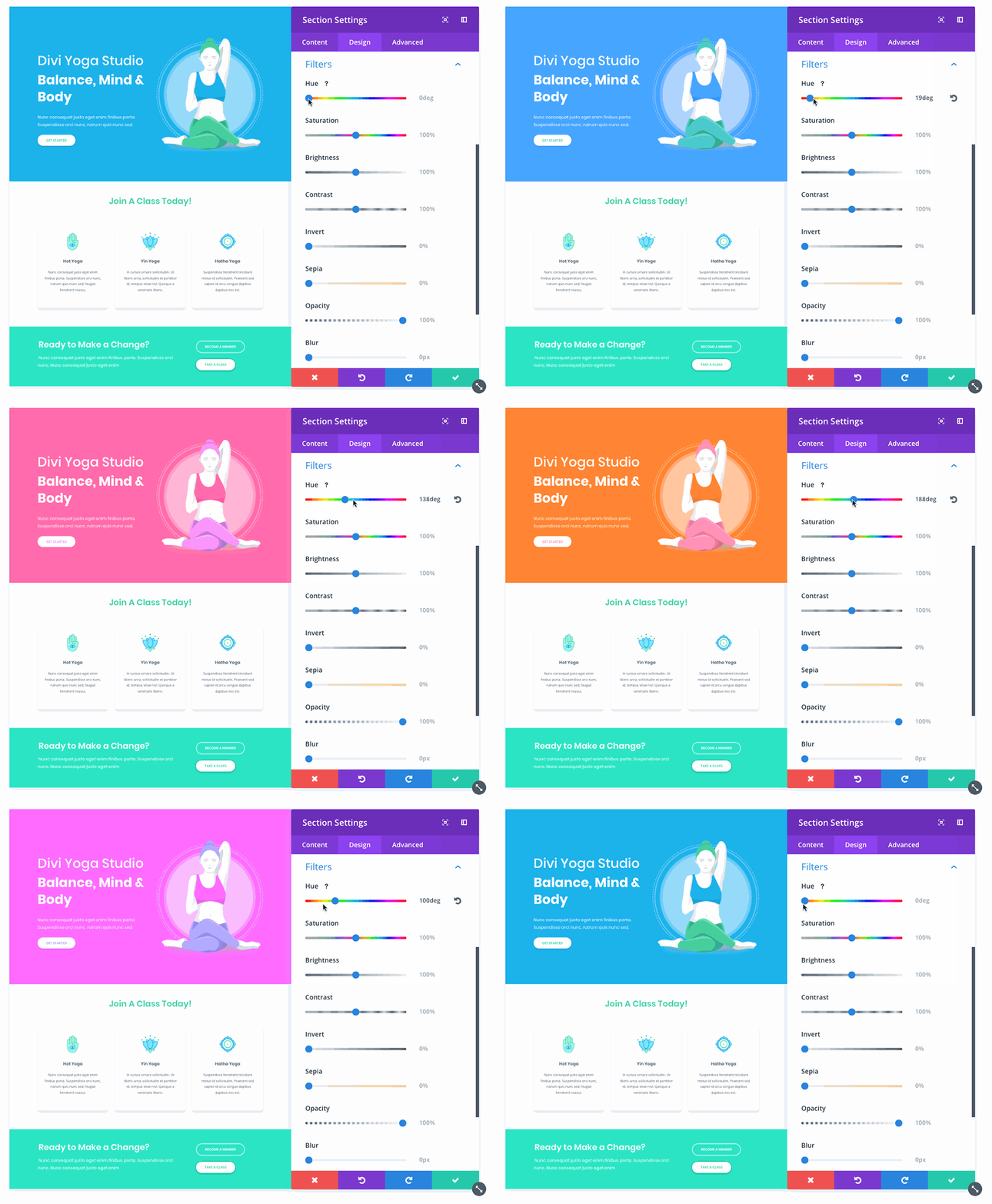
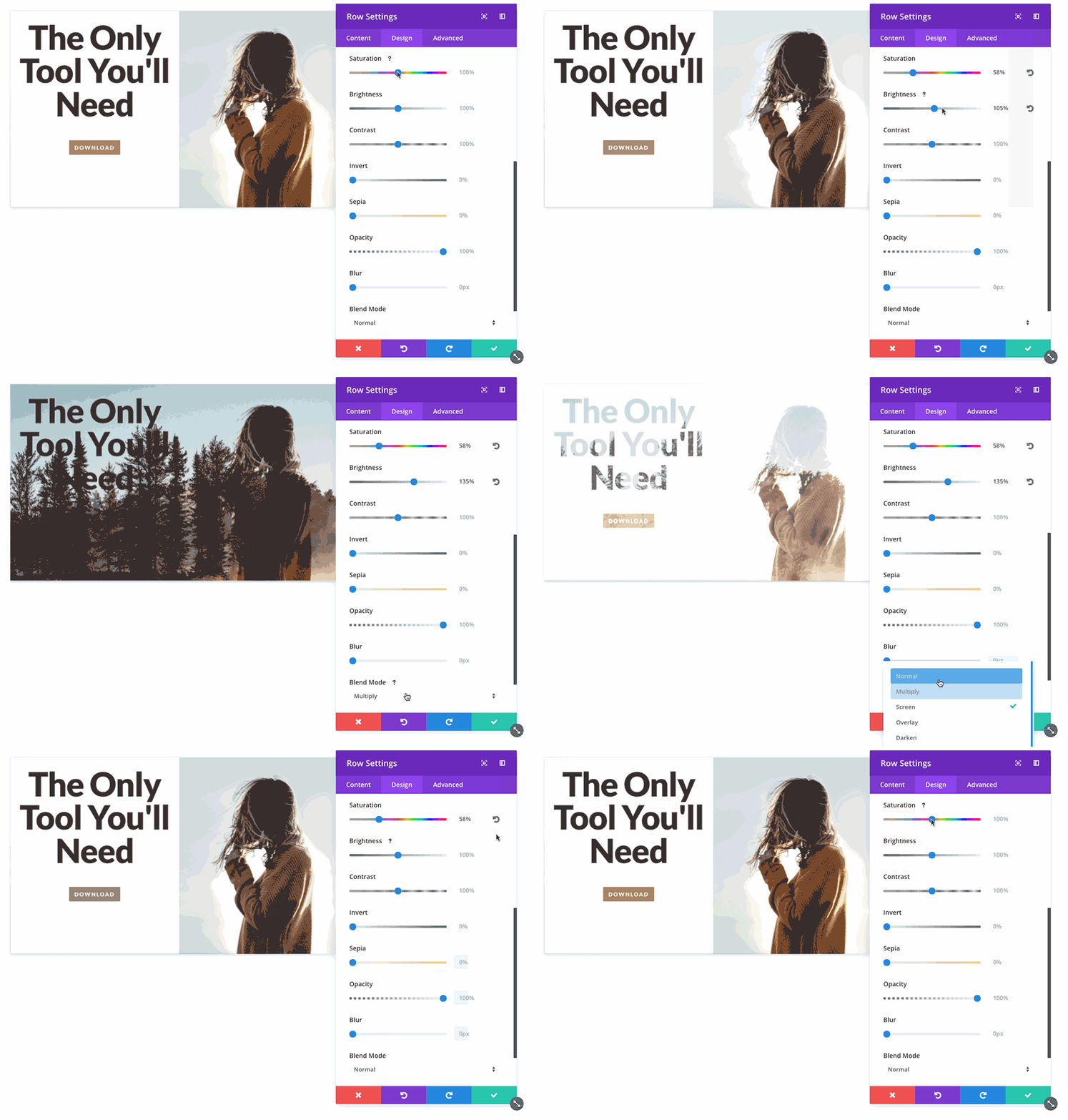
All Divi modules, rows and sections now have a new Filters option group complete with a new set of custom controls that allow you to adjust colors, apply effects and designate blending modes for any element on the page. These controls have also been added to all module images.
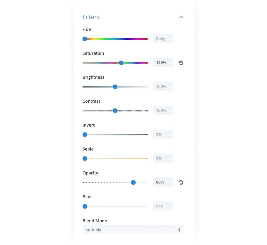
Adjust Colors & Stylize Your Page
Everything inside of Divi now has Hue, Saturation, Brightness, Contrast, Invert, Blur, Opacity and Sepia controls that allow you to quickly adjust the appearance of any element. These new features are the perfect way for anyone to bring their unique flare to the page, and the collection of controls really lend themselves to experimentation and exploration. Even if you don’t end up using these filters on your completed page, they are a great way to make sweeping adjustments as you explore new possibilities for your design.
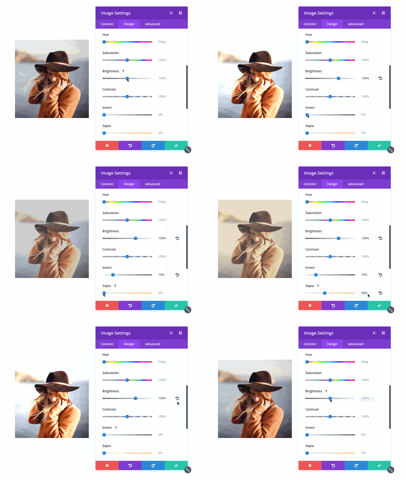
Get Creative With Your Images
Every Divi module that contains images now has unique color filter controls for each individual image, which means you can apply color effects to images without affecting the rest of the module. Color filters are especially useful for images, allowing you to apply Instagram-like styles with ease. Now you can take any image and stylize it match your design.
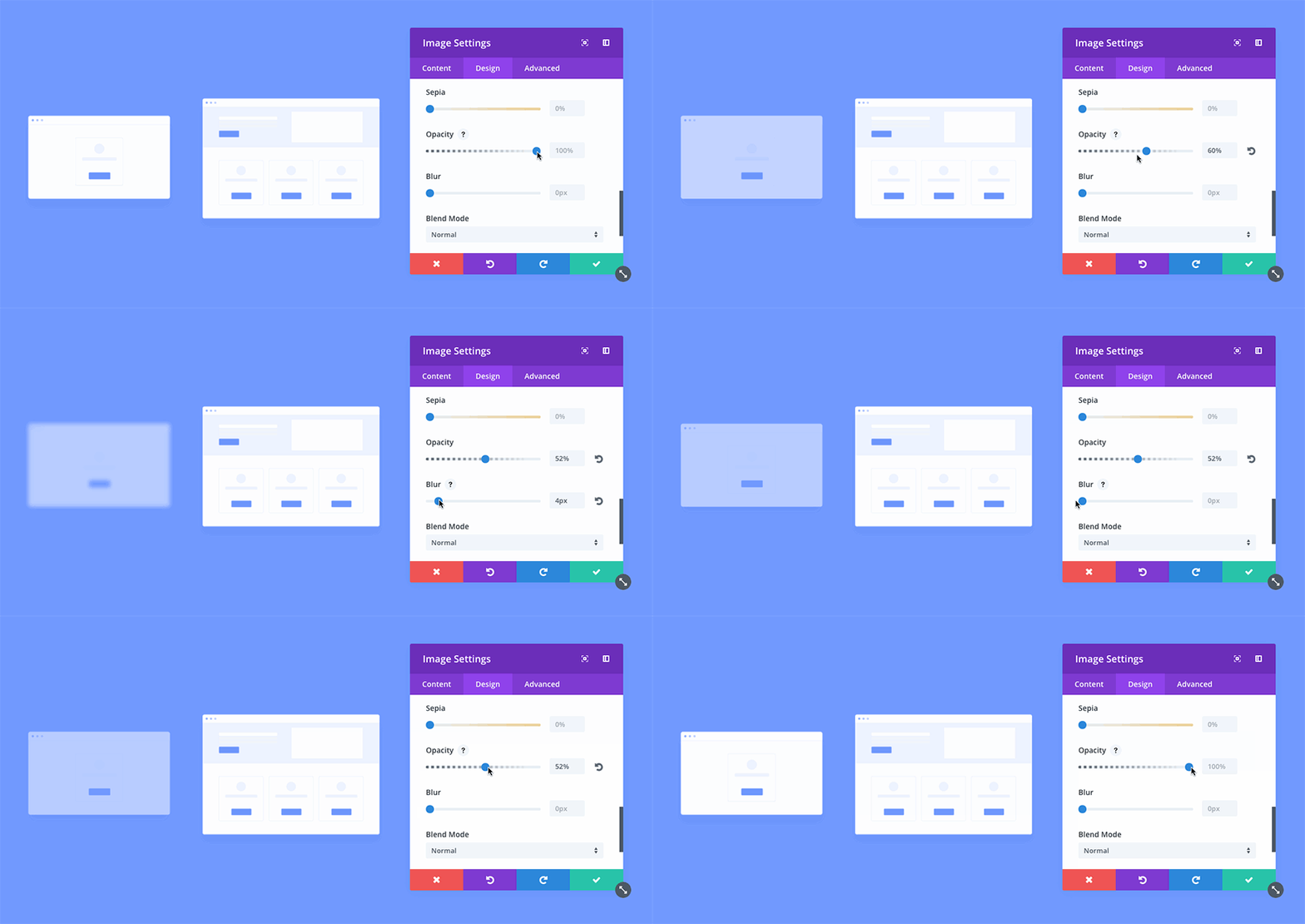
Add Stunning New Effects
In addition to color filters, we have also added Blur and Opacity controls. Now you can create stunning depth-of-field effects that really bring your page to life without needing to open Photoshop or compromise the integrity of your original image. No need to use super-big transparent PNG images that take forever to load.
Create Layered Styles Using Blend Modes
In addition to color filters and effects, you can also apply blend modules to any Divi element. A whole new range of effects can now be accomplished by blending layered elements, such as columns, rows and sections in creative ways. When combined with filters, the possibilities are countless.
Coming Soon: Custom Hover State Designs
The filters themselves are not the whole story, and one of the main reasons that we are adding these new options is in preparation for an amazing upcoming Dvi feature that will allow you to customize the hover state of every single design options in the Divi Builder, giving you the ability to create stunning color transformations and effect transitions on hover. It’s an extremely useful update made all the more powerful by filters, and it’s something you can look forward too very soon.
![]()
10 Stunning Examples Of
Filters, Effects & Blend Modes
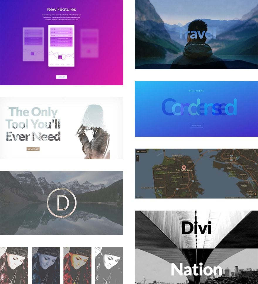
There are all kinds of new effects that can be accomplished using these new options. Just take a look at some of the amazing designs our team was able to create!
Example One
Example Two
Example Three
Example Four
Example Five
Example Six
Example Seven
Example Eight
Example Nine
Example Ten
The new color filters, effects and blend modes are available today, so download Divi and take them for a spin. Let us know what you think in the comments and don’t forget to check back next week for even more great Divi features coming your way.
Get 10% Off Today!
Today's The Best Day To Get Divi Or Upgrade Your Account To Lifetime
Join the most enthusiastic and loving WordPress theme community on the web and download Divi today. Using the new Visual Builder, you can build websites faster than ever before with its incredibly fast and intuitive visual interface. You have to see it to believe it!
Join Today For 10% OFF!Renew Your Account Today For 10% OFF!Upgrade Your Account Today For 10% OFF!






Awesome design sense.
Love Divi 🙂
I don’t know if I’m doing something wrong but when I use a “blend mode” (like “screen” or “multiply”) DIVI add a “et_pb_css_mix_blend_mode_passthrough” class to the image’s column. And — of course — the properties for that class are :
.et_pb_css_mix_blend_mode_passthrough{
mix-blend-mode: unset!important;
}
So even if DIVI is setting correctly the mix-blend-mode “screen” to my “.et_pb_image_1” it doesn’t work because I have also to set :
.et_pb_css_mix_blend_mode_passthrough{
mix-blend-mode: screen !important;
}
The problem is on pages where I want to use multiple blend modes (“screen” on one image and
“multiply” on an other for example)… And in each case If I just want the effect on my image an not my text in the same colum next to it…
Exemple here : http://manila.laugau.com/home/
Can someone tell me what’s i’m doing wrong ? Or if you have the same problem ?
Thanks a lot ! 🙂
@Nick
How about new header design options…especially for mobile?
This looks great – thanks for your work!
Thank you Nick and team! You guys ROCK!
You guys continuously blow my mind with awesome updates! Well done, again!
I love how you are always improving but like so many here i am asking for the basics to be looked at.
1. Menu – still have no custom hover over colour, no real customisation.
2. Blurb module – No button option, you have to try to build layouts with a blurb and a button underneath. This gets messy because of my next point.
3. If you have a row with blurbs in it and you press the keep all columns equal, it doesnt work, every single site i build i have to use custom css and its only one line …….
4 Forms – No file upload so I still have to use Gravityforms for all my clients needing anything uploaded.
I apologise if any of these have been fixed at the time of me writing this I have not see it.
Would it not be good to run a poll every week giving customers the change to prioritise what fixes they would most like?
Nice work guys, really loved it,
when can we expect upcoming hover effects
I like the idea. Just Divi? not the divibuilder? its not available in Extra?
This is a very nice update, and I like to see all the suggestions that people are putting forth for future upgrades or enhancements. I especially agree with the responsive image suggestions.
One thing that I would love to see, and something that I’ve struggled with on every Divi site I build is the lack of ability to define custom breakpoints for font sizes, padding, margins, etc. Currently we have three options to choose from to customize our text for screen sizes; Desktop, Tablet and Mobile. However, these sizes don’t always work correctly for us. For example, what looks good on a full size desktop looks terrible on a Desktop view starting around 1300 px until it hits the tablet view where you can define a different text size. This is especially true when you have 3-4 different size columns set up going across the screen. The text runs down as the columns get smaller but it doesn’t reduce in size until it hits the tablet breakpoint, and it just looks terrible. I know you can fix this with CSS media queries, but boy, this is a LOT of work, and for someone who isn’t very CSS savy, it is very daunting to figure out. It would be so nice to be able to easily set font sizes and spacing for text, blurb, etc. modules at a desired screen size break point, especially for smaller desktop views. Your wonderful development team has done so much with all the fancy color editing, animation, etc., it seems like the breakpoint issue is something that is very basic and should have been addressed a long time ago as it pretty much affects each and every user of your theme. Thanks!
ET never seizes to amaze me… Thank you for this feature! 😀
Honestly i am more excited about upcoming hover effects/transitions! But awesome job again Divi Team!
Fingercrossed ? !!
Where/how can we download the layouts used in this post?
@Nick Roach, Can we get a download of these?
Something late for the answer …
I’m waiting for DIVI 3.1. It’s am in the living, what’s next.
Amazing update! So looking forward to applying these to my websites.
Given the complexity of applying filters to sections/rows/modules it would be awesome to get a tutorial where the possible output and interactions are illustrated. For example, I tried to set one of these filters on an Image Module, but it didn’t seem to do anything. I’d like to minimize the time I spend clicking through options that have no effect. ;P
I’m not a photoshop user so I don’t have a good grasp on what the filters do when applied one at a time, let alone when combined across multiple containers.
Are there any relevant tutorials that would help us coders imagine what possibilities these filters bring? It almost seems like I need to take an advanced photoshop course to understand how to build pages now!
<3
Hey Emilio!
It’s easier to write in support, they advise sources.
I kill all my free time on DIVI and I don’t regret it.
Fantastic addition! Is there a way to use filters on a SECTION without affecting the ROWS and MODULES within that section? I’m a new user, so maybe I’m just missing something obvious. I really want to simply blur a photo background and keep my text sharp and unaffected overlaid on it.
Yeah, me too.
Same thing for Row module. I just want to blur / filter the background image. Not the whole content.
A question: why will someone blur everything on a section?
Excellent update as usual! Well done ET…
It certainly a big new update BUT…It seems not possible apply a filter only on background…the filter involves also text and images. I’m wrong?
thank anyway for your job
Looks pretty good to me.
Here’s a question, when I view the demos, they are terrifyingly slow, and jumpy!
I work through ethernet not wifi, so how is this going to look to my Client’s customers on their mobile via 3G!!!??
Just purchased our license during the Black Friday Sale. Haven’t even used it yet, and already it’s getting better. It’s like going to the car lot and buying a Ford Fusion, driving off the lot and while your driving down the street it starts becoming a Mustang! How cool is that! Nice work, Nick and team Elegant Themes. You make me happy!
I also hear you !! LOL feeling a bit the same!
When I bought mine, I thought I was getting Something really nice, I didn’t dream It would become a Ferrari on steroids!
How did you create Example No. 4?
Kindly!
P.s. Love this!!!!!
We’ve got a few posts coming out soon that will show how we created all of the above examples!
I’m also very interested how these are done!
Looks great. Thank you Divi staff for ALWAYS improving.
Really awesome! Is there going to be a tutorial on how to use them? Totally love example one!
Yes!
awesome, where can i download those layouts???
Thank you for the great work!
But 🙂
We are cool, we use Google Chrome etc. But our clients and (which is the most important) the end users – our client’s clients – use devices with preinstalled Windows and MS Edge mostly. We create websites for them. All those amazing effects should be accessible for them. That is the missing part – most effects look incorrect or not work in Edge.
Truly amazing! Thank you!
The update is awesome but still lacks a big function. When changing the Filter settings for, lets say, the background image in a Section – you also change all the filters of all the objects in that Section. It’s buttons and texts and everything. So you can’t get a Sections with a blurred background and a crisp looking C2A-button on top of it – cuase everything gets blurred. The filter settings should be contained to only change section/object/button/text that you are changing.
That is sadly how CSS filter effects work. They filter everything inside the container they are applied to. You can get around it with some custom CSS by using two sections/rows or modules. i.e. set the filters and background on the first, then absolute position the second (with all the content) to sit on top.
Good News!
Thank you.
Header Image Alt Text anyone?? Anyone!!
Please fix this.
It’s great you’re pushing and developing new features but please address the basics.
In the meantime you can add Alt text to any uploaded image by selecting it your media library 🙂
Thanks Liz, this doesn’t get pulled through and you cannot set alt text for this in the module.
Please stop blowing Up Divi unneccissarily. Better you work on the issues I and other user posted on the Divi Suggestions. Like a customizable search-result page, or the ugly german translation.
This all looks fabulous, another feather in you already super large and highly feathered cap… But
Please can you spare a thought for us newbies. I have been using Divi and WordPress for a couple of weeks now and the learning curve has been huge. I have already created some great pages for my new website and am generally super happy with Divi.
However, I have been all over this blog and your site looking for details on how to install the update. Everything is about signing up today to try out Divi and downloading it, which I already did when I signed up and joined, but absolutely nothing for existing users on how they can get the update.
In my Divi theme control panel I have found the updates tab and entered my API key etc & refreshed but then nothing…..
Sorry if I am missing something really basic, but I won’t be the only new user having this problem. Please spare a thought for us and give clear guides how to get updates – we are not all propeller heads!
Thanks in advance xxxx
Hi Samantha, 🙂
To check for updates to anything relating to Themes or plugins, Go to your WordPress dashboard first.
Then click on (Updates) from the word press menu panel on the left hand side of your screen.
If any updates are available that you have not already done, relating to WordPress itself, your Divi theme or any plugins you may have installed already, Those relevant newly released update versions will show up in a list quite clearly in this section.
When you see that an update is available in this area, simply tick the checkbox next to the update in the list ( to select the update) This lets WordPress know specifically what you want to update, Then just press the update button.
You will realize what to do when you see it. Try and follow the prompts, albeit some of the text is small and not always immediately noticeable as a clear instruction instantly, you may need to look at your screen and read what it says for a few seconds, I hope this helps Samantha, Liz x 🙂
Theme and Plugin Updates should appear automatically in WordPress as they become available. There really is no need for documentation on it here as it’s a feature of WordPress that ET Themes and Plugins fully support.
If updates aren’t showing, that’s abnormal behaviour and I’m sure ET Support will be happy to help you figure out what’s going on if you raise a ticket.
Thank you for this feature but in my case I have a HTTP ERROR 500 just after the update … Someone with the same problem?
Awesome!! This update will save a lot of time.
Thank you. for new designing learners like me, this tool helps me alot in my work.
Nice update! And even better news about the upcoming hover effects. That will be a game changer. Keep up the good work!
Wow, really unbelievable. I only hope all these great updates don’t reduce on server performance too much.
@ Mr Nick Roach ….
How do you keep your cucumber so cool? Seriously I don’t know how you manage to keep a straight face while delivering feature updates like this on video!
I almost passed out due to fits of excited giggles, I was thinking surely he’s going to giggle any second, but nope! The cucumber was cool and straight faced all the way through while I was beside myself with disbelief, awe and excitement. WOW WOW Wow…. My mind boggles with creative imagination after seeing this feature update, OMG This is insane!!! Thank you 🙂
Don’t know where else this might be asked, except for perhaps on these sorts of blog posts…?
Was watching Matt’s State of the Word address at WordCamp Nashville the other day, and most of the questions were centered around Gutenberg, with a lot of concern about how it was going to be interacting with themes like Divi…
How does ET see Divi and Gutenberg engaging, when Gutenberg comes out as a part of core in WP 5.0, which it seems may go live around April or so, 4-5 months from now…?
Apparently, as Ive seen in a WP forum we will be able to turn Gutenberg off and either use or not use it by choice.
That was also mentioned in the address, as an intermediate stage, eventually to become fully core and active… I am curious if ET folks might begin commenting on Gutenberg and the future of Divi…
John, there are already plugins to remove it, and there will be more as time goes on. It’s more than clear that a large % of WP users don’t want Gutenberg.
Don’t know where else this can be asked, except for perhaps on these sorts of posts…
Was watching Matt’s State of the Word address at WordCamp Nashville the other day, and most of the questions were centered around Gutenberg, with a lot of concern about how it was going to be interacting with themes like Divi…
How does ET see Divi and Gutenberg engaging, when Gutenberg comes out as a part of core in WP 5.0, which it seems may go live around April or so, 4-5 months from now…?
Jaw Dropping Update, Wow!
Awesome thank you, this is amazing!
Obligatory feature request: More header customization options and the shape dividers you mentioned above ?
The new filters and blend modes applied to image and type look really great. I’m looking forward to having a play and giving these a go. Great work and thank you!
All the best,
Neil.
So exciting! I love working with Divi and would never look at another theme again! 🙂
Amazing update, thank you Nick
As a performance driven developer, i hope your team consider the impact on resources taken by divi. Love to see how divi can achieve a lot of thing, but hope this not caused us to have a slow website
Do you guys ever sleep?
LOL… I was wondering the same…..
Map is not working in your preview page.
So you’ve pick cream of latest CSS3 options for image manipulation that is not very backward compatible, but with your layout code you’re still in stone age. How about spending some time and think about using some widely supported flexbox and maybe css grid? How about nesting rows and defining breakpoints on our own?
I know you’re relying on simplicity of your demos, but in real world we need some more flexibility with deciding “how” and “when” our design fold to mobile.
Moreover one year ago I was informed that you’re doing something to help with “terrible” interface and modules translations (Polish in my case), and that part is still not updated.
Thank you for blending modes, but PLEASE work also on core of Divi 🙂
Konrad your on the money mate….. ive asked for nested rows/columns for a while, infact i got smashed by many people for voicing my opinion on this about a year or two ago…. i gave up and stopped posing on many popular Divi facebook pages.
Breakpoints manipulation is a massive headache for us also, and involves a lot of css hacking to get it right, it should be something easily defined for each breakpoint.
I can also bet you’re having a hard time with header manipulation and limited menu style and manipulation?
I really do like what Divi is pushing out with every update, however, we are still limited in basic layout containers at the core they provide without TRUE freedom to create layouts we want.
You are right. first ET should fix the basics
+1 for CSS Grid
I love all the new Divi updates!
Two questions:
1. I noticed the transparencies on this update and others before don’t work with Microsoft Internet Explorer or Edge. While I hate both of these browsers, is there any workaround?
2. Several of these recent updates have impacted or broken our child themes.
Any suggestions to resolve this in the future?
Genius. x
Awesome update. But the hover state update is going to be even better. That’s been a long time coming! Keep up the great work.
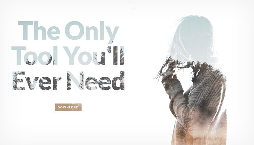
Fabulous new feature, just need to figure out how to replicate Example 1 where the letters are transparent against an image background. Look forward to the hover update too.
Very Nice!
I love what you guys are doing. I pretty much only design with Divi now. I do have a suggestion though.
1. Id love to see a quiz builder.
2. It would be cool if there was something more creative to opt into.
Thats my two cents but I love the new features.
Awesome!!! Thanks again
One word… WOW!
I’m a pastor and don’t want to cuss, but this was really one of those “Wow” moments. Although, it wasn’t wow that came to mind. Seriously guys… game changing stuff here!
You should watch Fr. Ted. Great show.
Did he actually say :
– ” …upcoming feature…”
– ” …customize the hover state…”
– ” …every design option in the DB…”
– ” …coming soon…”
– ” …check back next week…”
?
😮
…mmmm!!!
It’s “next week” 4 times now…
I like the mention of HOVER for the future. Waiting.
This is great, every Divi update feature is very important for us. I can’t wait for the coming Divi feature about Hover effects!!!
Thanks a lot!
I don’t know why I’m bothering but….
WHERE ARE RESPONSIVE IMAGES IN ALL YOUR MODULES?
Nine hundredth time I’ve asked and not a single response from Divi.
I have a lifetime license, gonna sell it. Anyone interested?
Probably for the best Paul – I will give you £10
Divi Booster has a setting to fix this, in addition to other numerous css fixes out there.
Again, I’m not a developer, but I responded to a similar comment a past release post. Sorry if that never made it to your inbox, but it definitely had a small thread going.
Que?
LOL—I always look to see if you’ve added the responsive image request in the comments. Don’t stop now! You know what they say…the squeaky wheel get the grease;)
I love all the updates and continual work that is done on the Divi theme, but I agree with you on this issue with responsive images. It should be addressed and it would be nice to know if it was in the pipeline.
Dear Divi team,
For some time you have provided us with really nice updates and even exceptional. This is very good for us because we can quickly propose nice designs to our customers. But I have some fears: what about code, performance? Will not all of this weigh on our sites? Will the risk of incompatibility with extensions not increase? I have fears too on all my other Divi sites with child theme. Sometimes the code of my child theme breaks because you have integrated a function into the theme. I noticed on some sites that the slider adds line breaks above and below the text, as soon as I open it (even if I do not change anything!) And it happened on a text module in another site. (and there is no child theme for this one)
So yes congratulations to you for all these novelties but I hope that you are not too much carried away because we also need a reliable and compatible theme 🙂
Tks!
Hi Cecile,
This Quick Feature is using CSS blend mode and filter so this simply includes a few lines of CSS when you change a filter or set a blend mode, there is no visible performance impact on the frontend.
In most situations, the risk of incompatibility is close to zero, however, the risk is there no matter how you put it. What I can say is that we are doing what is possible on our side to avoid that from happening. We are also doing our best to track these down and fix them as soon as possible.
Regarding the Slider issue, if you didn’t already could you open a ticket in our support forum? We will be happy to take a look.
Hi Vlad,
I checkout out the examples gallery (https://www.elegantthemes.com/preview/Divi/filters/) and noticed a dramatic performance loss. Upon opening the console it got even worse. I noticed some complaints form the Google API about exceeded quotas too: https://imgur.com/a/8czZd
Cheers
Mike
Wow …. amazing work ET! Just loving it …
Any plans to bring all of this to the “divi builder” so we can use it with our other themes?
Dean, all the builder level controls are also available in the standalone plugin. Basically, all the recent Divi Quick Features are also available in the plugin.
It is not showing up in Extra, via divibuilder or visual builder. I concure with Dean.
Its a very nice update. I have a bug problem, and the problem still exist.
i have advertised on facebook, but the css animation doesnt work and the menu on the facebook browser app stucks.. i thought it will be update with this version of update. but no:(
I have already made a topic about it on the support side. still nothing? i cant update it.. i still using v3.0.89. untill im sure the bug is fixed.
thanks!
Sorry about that, Flexa. The development team is still looking into the issue you reported.
Hi Vlad Patrascu,
Thanks for your reply. i will wait for it 🙂
What about modifying the navbar? I don’t mind doing some CSS but others…
Impressive update but the page for download of upgrade isn’t loading?
Jt
WOW! Just wow!
These filters and effects are very impressive…visually, but what impact do they have on:
1. Load time for the page
2. The amount of code necessary to display the page
I’m concerned that all these visually impressive effects impose a heavy burden in terms of code weight and page-load slowness…
It is necessary to understand that the code is created automatically and by algorithms, and this does not mean CLEAN.
That would be an implementation detail or as they say on Fr. Ted, an ecumenical matter.
In the numbers of the answer is not received, but with excessive use it certainly overloads the situation. As always, the main thing – without fanaticism! That is, you do not need to create pages as a list of all the features https://www.elegantthemes.com/preview/Divi/filters/#demo1
The demo page with a list of all features loads instantly “first time” for me on desktop, tablet and mobile phone. 🙂
People are not as impatient as Google makes them out to be! 🙂
Both good points, Liz.
Still, I’m pretty sure there’s a price to pay (overhead) for these fancy effects. In light of that I’m keeping my pages simple and easy to understand. Image effects will continue to be done in Photoshop and NOTHING pops up, flies in or is animated. I find that stuff ANNOYING and DISTRACTING at best, so I don’t inflict it on my visitors.
KISS works for me, and is probably the best approach in most cases.
No, but Google Rankings still takes priority.
It’s just some endless stream of perfection!
Divi Builder now surpasses all other web authoring tools on the planet. Makes building a website even more fun and with endless graphic design possibilities.
Nice! But waiting for the most needed feature: more variations in blog styles. The possibilities are too limited.
+1
You may want to try Extra–it is more blog focused than Divi alone.
Very cool update. Eliminating some uses of photoshop or other image editors. Embaded right into the build.
Divi Changing everything. The History is Written Again.
OMG this is amazing! It’s like Xmas has come early. I get rather excited when I see these emails ? Thanks so much for all the work you do for us.
I have only one suggestion….PLEASE can we have more advanced and flexible design options for the menus?
This is the one thing that I struggle with as CSS frightens me a little. Thanks!!
I agree and the sidebar/widgets please!
I’m doing some experiments for example with blur but if I apply blur to the background image, the effect also applies to what I have over 🙁
Kelly, I agree. More menu design options are needed
Awesome update. Thanks to everyone at Elegant Themes!
You’ve made making sites fun again.
It is really a great and effortless alternative to BootStrap. Competition is a great thing 😉
awesome Nick! this is really great!
now the only thing need more style option is the MENU
please add more features on menu to make one site really different from other
Marco, I agree and have been hoping for a long time to see more design options for the menus
WooooooooooooW !!! it looks so awesome !!!!!!!!!!! I’m waiting for tutorials on how to get the best out of it ! 😀
Hey, Jump in and Play…….. It’s awesomely easy 🙂
This is absolutely WOW!!!
I love it. No need to use Photoshop in this case. Very cool!
Thanks folks!
Rolling in love with this saying: “We want people to be able to jump inside of Divi and start their ideation process, to take a blank canvas and mold and massage it into something wonderful”.
Now, I’m wondering if ET has gotten a veteran developer from Adobe…this is a massive creative design update and the +1000k effect for me is the transparent and image filters between trees. Because I can make text/image semi-transparent between background image. Thanks a millions for this. Divi Web Design Suite is no1 and a go-to for modern and fast WP web designers and developers
Very cool. Will save me from having to do this in Photoshop which is veeeeery time consuming.
This update is great! But there are more basic improvements necessary on some existing features. For example:
The theme customizer is still quite poor e.g. regarding the font configuration. Without plugIn you cannot properly manage the font configuration.
The design adjustment possibilities für the navigation should be improved (every divi site can be recognised by the navigation)
etc.
John, Bill, thank you both for your feedback! ?
This is definitely something that we all agree with and we definitely do have future plans for that. Keep an eye out!
Agree. It’s great to have all these bells and whistles but there are basic features I would love to see polished and/or added. Particularly global settings. Being able to set padding and margins globally per module. Heading padding and margin global settings instead o just line height and kerning. Being able to set these globally means much less work and a more professional consistent website. Having a global setting for full width pages and posts/no sidebar would be an great help. I love Divi and love using it to design new sites but redoing an existing site with 500 pages and 1000 posts is too hard. A global setting to have a full width post title without coding new templates is another example. More global settings would make hand off from designer to owners easier with less training. As it stands now, I hand it off with some training but a month after the owner has begun working the site, their content is a mess. If I could set this stuff globally, (and better still lock the design) owners would be happier long term.
There is so much to love about Divi but mostly I’ve gone back to using Genesis combined with Cobalt Apps Dynamik theme and then using only the Divi’s layout builder plugin.
+1 global settings
Hi guys, hi Nick!
New features look stunning and amazing, I’m already playing with blurbs, bar counters and images, and this is a huge improvement!
A massive thank you from Italy!!!
This is excellent! Looking forward to trying this out. Does this release also fix the bug that keeps Divi sites from working properly in the facebook browser (i.e. animations, google map, mobile menu, etc.)?
I am sure It is Facebook that doesn’t not support Animation not Divi!!
Actually, there have been dozens of support tickets submitted to divi as of December 6 and 7 regarding this issue. Divi recognized it as a bug and said they are working on it. Many of the people who put their tickets in said their sites worked perfectly on the facebook browser until divi 3.0.90. They said when they reverted to 3.0.89, their sites started working fine again in the facebook browser.
Yep I am experiencing this across multiple sites. Whether its facebook or not, the effect this is having is huge and it should be a top priority to be fixed. Transparent headers are completely shocking atm and the animation problem means anything animated just doesn’t appear. Not cool.
Ideally this is a graet update. However from a practical sense it becomes pretty much a lame duck when the sites are viewed on the dreaded IE and Edge. I have clients who still use those and so do their clients, so having something out the box that still takes those dianosaur browsers into account is so important. I’m already having to modify a revamp due to using new features that just don’t work on IE and Edge.
Also, agree with the columns addition, 4 columns max out the box is frustrating, and also *yep I keep saying it* more flexible design options for the header menu please!
Ta 🙂
Thank you, Stewart!
We are actually working on new row and column controls and we also have plans for better header customization options. ?
Header options is a must, it has been ignored long enough…. header tweaking involves lots of hacking ……
+1000! The header design option would be a massive game changer!
+1 +1 +1 +1
“more flexible design options for the header menu please!”
YES !!!! PLEASE !!!
It is about three years I am with you. Your are almost the only website with weekly amazing surprises. Thanks you !
Sweet. Keep up the good work.
Amazing update guys and perfect timing too for the design i’m working on!
Looking forward to see the next features 🙂
Nice! So many new options…
Is there also any possibility to have shape dividers like Elementor does (https://elementor.com/v130-shape-divider/)? Please…
Oh yes shape dividers will be fantastic!
+1 Really need those dividers O_o
Already working on it, stay tuned 🙂
Finally… bring lots of options please the divers shapes… no more css hacking 🙂
Yes! these custom dividers would be super nice! Let’s keep on that designed focus route…
Really excited to have these features!!
Any sneak peek about these shape dividers or hover effects, please …
Great!
You made my day 😉
I am waiting devider shape also.
Roger that ! 🙂
Great! +1
waiting for it nick 😀
That will be fun.
Awesomeness!
Will be playing with this pronto..
😀 😀 😀
yeah.. realy cool but did you forget IE9? :)) because it doesn’t support blending filter.
30 June 2018 is the deadline for disabling SSL/early TLS and implementing a more secure encryption protocol – TLS 1.1 or higher (TLS v1.2 is strongly encouraged) in order to meet the PCI Data Security Standard (PCI DSS) for safeguarding payment data.
IE <11 is therefor as from that date no longer even legally allowed to be used ; or even your website to support if you have anything what needs to be PCI compliant.
So really … blending filter in IE9 ?
Edge? It doesn’t support image blends. But it does do the hue and blur.
Edge will catch up with what is supported eventually! I guess it depends on Demand.
Thanks for the heads up. I don’t walk in the MS park that often.
I think it is case of everybody should forget IE. Even MS want you to forget it and use Edge.
That’s not an option though.
I hate IE with a passion, but if a large number of clients use IE, and their target audience uses IE, then my websites HAVE to be IE compatible, absolutely no excuses.
This means no css variables, no filters.
I hate IE so much. .. and Outlook 2007.
I wonder for how long can one keep up this business or service model? I guess if the automobile industry had done it like that, we would still all have horses. I know it can be tough for Lonestars who need every contract and deal. Yet, I would consider a customer who clinges to totally outdated and insecure software a risk to my business. Do visitors of such customers’ websites appreciate the dull and passive content that is possible when totally IE compatible? Just wondering how so many designers and webmasters simply follow through, when customers stubbornly stick to old rubbish. I think, they place their responsibilities on the designers shoulders to a degree. They simply skip the tedious and costly task of embracing newer technologies and enforce service providers to find almost impossible (and cheap) solutions for the gap of technology they create by their ignorane. It’s definitely not always that simple, I know. Changing the browser version in a big company or a government institution isn’t done in a few months. Yet, offering workarounds definitely increases this problem in the long run instead of solving it. You cannot simply demand from software developers to deliver solutions for something that should be solved on the very opposite end. If anyone, MS would be the one to deliver better software.
IE is obsolete and no longer supported by MS, it is not included with Win10 either. MS forces Edge now, which will catch up with what is supported eventually!
Those people who still use computers with Operating systems prior to Win 10 will be forced to move forward as soon as they make their next computer purchase, the only Windows based Op system available now is the Pre installed Windows 10 with Edge.
At least this is how it’s been in Australia for the last 2 years. I can’t speak for other countries markets though… 🙂
“IE is obsolete and no longer supported by MS, it is not included with Win10 either.”
Try hitting the Windows button, type Internet and you’ll see that IE (11) is still very much available in Windows 10.
Although obsolete, and although I hate IE with a passion (as I’ve already mentioned) it’s not something easily ignored.
http://gs.statcounter.com/browser-market-share/desktop/australia
I work in Australia too. Our studio has one lonely windows laptop amongst the sea of macs. (6 iMacs, 3 Macbooks, everyone on iPads and iPhones…. 1 Dell) But I have to make sure my websites work in IE.
It’s not an option yet. IE is 9% on desktop browsing. Edge is 6%. This is not a number that can be thrown under the bus.
On that note, all the recent “features” Divi has gotten are mostly just eyecandy for the hobbyist on a modern browser. Disappointing.
However, they fixed the text alignment button (which was fine, but broke in 90) so it works again. So there’s that.
Stunning and a tantalizing toolset! When hover states are added, it will be extraordinary.
Would it be possible to think of bootstrap compatibility?
i love divi so much .. i asked for overlays i get moooooore .. thanks all divi team everyone
Seriously guys, just awesome. Can’t wait to play around with it!
Well done! 🙂
So I love the idea of the hover effects options that are coming soon, but isn’t that feature really only valuable for desktop users? With the rise in mobile usage, won’t a large portion of web traffic miss out on the gorgeous effects? 🙂
If they don’t hover they would likely miss out (lol). When I’m using my phone and a website says (ex.) “hover over each option for more information”, I can either hold my finger on an option for a sec and let go to see the hover effect in action, or I need to push the option once for the hover effect or twice to select it.
Excellent development Nick and Divi team, I Have 1 year License, How can I optain this features in my DIVI THEME?
Thanks/George
Wow, it just keeps getting better, I see uses for this all over the spectrum, Cheers! you crazy mad scientist 🙂
Outstanding addition. The Blend mode feature is just WOW! It’s almost like having Photoshop built-in within Divi. We’ve been using Divi for about a year now, and we’ve seen the builder plugin evolve into an incredible website design tool. Great job Nick and team!
Looks awesome!
Very nice! I knew the hover features were coming but didn’t expect it so soon! Looking forward to many needed updates in the future.
Holy s**t! This update is great, I always wanted an overlay setting. Divi is becoming easier to use and giving us the chance to make real good websites just using the divi builder. I guess I’ll be using photoshop way less. Keep the good work! Thanks.
Columns update more important.. Any update on this important feature would be nice.
Also a major theme customizer update as well is needed.
This is frigging! amazing indeed. Well done!
BTW, have we reached v100 yet?
Very impressive. It would be great if we could get a copy of the live layout to experiment with please.
Dito… please make the examples avaialable 🙂
Yes – please provide a download of the examples so we can compare and contrast on our own sites 🙂
I second to that!!! I’m struggling to figure out how you guys achieve some of the effects but no success so far… json file would be a treat! 🙂
And of course – THANK you for all these cool updates, it really empowers people with little/no coding skills 🙂
All this is lovely, but there is still no way to usefully edit “text” using DIVI – the text areas force you to do all of your editing through a window about the size of a cigarette packet. A CMS that doesn’t allow you to edit the Content!
Please please please add a full screen text editor, and also a shortcut to click straight to it rather than hide it half way down the page.
Steve, Irishetchet, thank you both for your feedback! ? I will share this with the team.
We are working on a fix for the scroll issue for the text fields in the settings modal.
For the Visual Builder, have you got the chance to work with the Inline Editor introduced in Divi 3.0? It’s pretty cool and it should help with editing text.
https://www.elegantthemes.com/blog/divi-resources/divi-3-0-sneak-peek-a-look-at-the-inline-editor
Hey Vlad,
It would be also cool, If employees like You, had an identifying background color just like the boss ie, Sir Nick, in this comment section.
When we see the lite green around, we know he spokes.
You could have that pinky red used in your brand logo, links and join top button…
This could reinforce the idea of being assisted by actual team members…
Just sayin’…
are we using the same themes? there were some pretty gnarly updates to the text modules recently
I think what they mean is that the text area is small, especially on the front end pop settings boxes. Also the scroll bar does’t respond to the mouse wheel and the resize handle of the text area is hard to grab.
It’s not a deal breaker but would some improvements were made.
Divi Booster has a setting to make the settings panels full size on the backend, which helps a bit.
I have requested the settings opening in a separate window ala the Chrome inspector so that those of us with a second monitor can view them there…. Might be a big ask?
That’s a pretty good idea, actually. I like it.
W O W!!!!!! You make our life much better at every updates!!
If I was to look for a job, you are so inspiring that you would be a team I would definatly work with!!
Kind regards,
This is friggin’ amazing! Thank you, Nick!
Now this is an awesome update!
Nick , They are nice thank you ,but , divi builder doesnt work with bootstrap , Visual composer works well ,I have tested so I think there is no limit for divi to do same thing with bootstrap .
Divi does it’s own variation on bootstrap. You can even apply flex-box to modules, rows and sections. You can even en queue bootstrap and use it in modules, but I guess you have to dedicated to digging under the hood.
Divi does quite a lot but can’t do everything…yet. We need to be patient. In fairness to ET and other vendors of these page builder themes, we are at the incunabula stage, it’s early days still, relatively, in the web and IT World.
I think the team is doing a good job. There are lots of things I would like to see and am willing to wait.