![]()
Apply Awesome Box Shadow Effects
To Any Divi Element
The new Divi Builder box shadow interface makes it easy to create stylish shadows and apply them to any module, row or section.
Today we are updating Divi with brand new Box Shadow options that give you the power to easily design wonderful shadow effects and apply them to any module, row or section on your page. You can build custom shadows using our new box shadow controls, or you can quickly select from many pre-made shadow styles and apply them to any element with a single click.
![]()
The New Box Shadow Controls
Box shadows are easy to create in the Divi Builder. Craft your own custom shadows or apply one of many pre-designed styles with a single click.
Full Custom Control
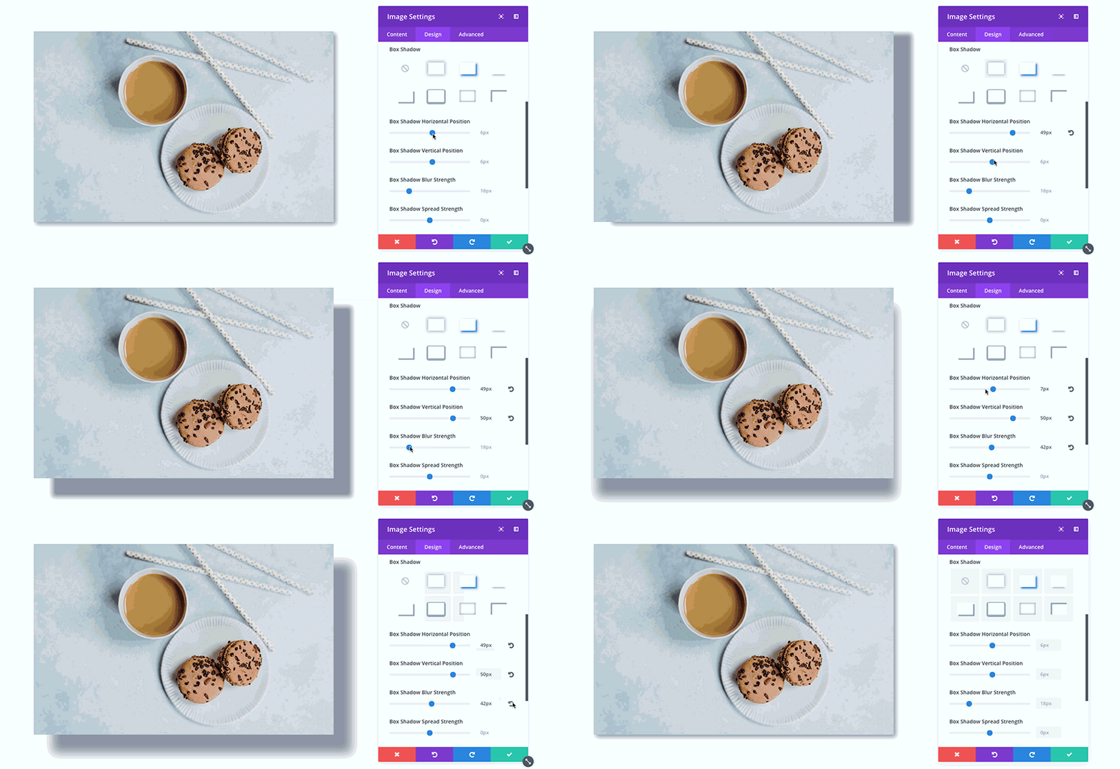
Every module, row and section in the Divi Builder now has a full set of box shadow options. You can control the box shadow color, position, blur, strength and build both inset and outset shadows. Creating and customizing these shadows is so much fun in the Visual Builder.
Easy To Use Presets
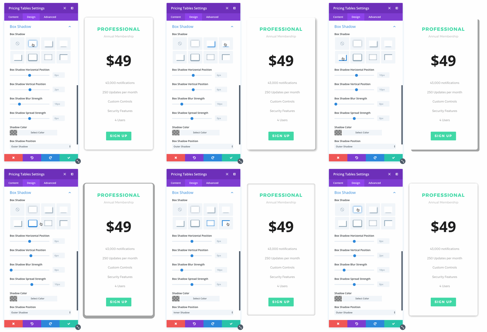
In addition to building your own box shadow styles, you can select from several presets that we have designed for you. These seven styles let you quickly apply all of the most common box shadow effects with a single click. Once applied, the shadow can be further customized using the full set of controls.
Add Shadows To Any Element!

Everything in the Divi Builder can have box shadows added to it! It’s amazing how many creative ways this one set of controls can be applied to different modules to create new and interesting styles.
![]()
10 Stunning Effects You Can
Achieve With Divi Box Shadows
You will be surprised how many cool designs can be created using Divi’s new box shadow options.
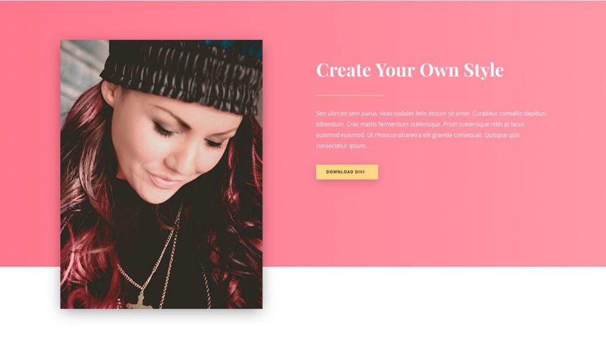
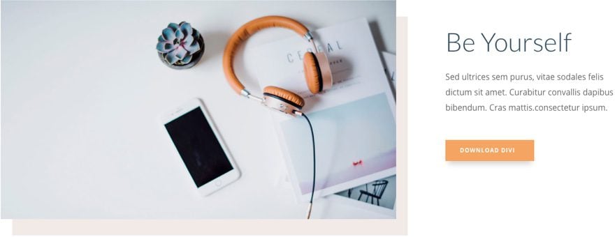
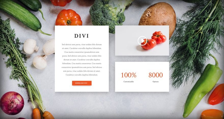
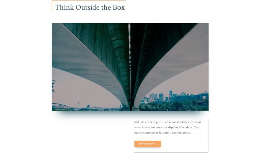
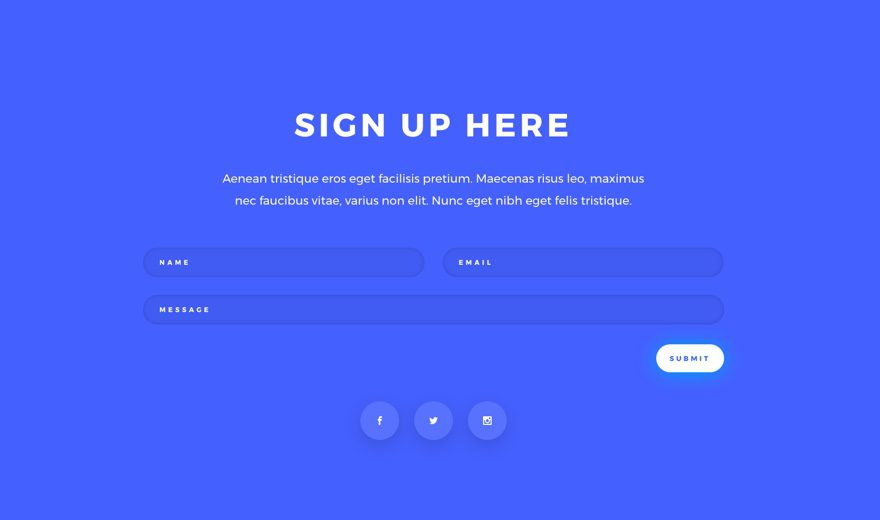
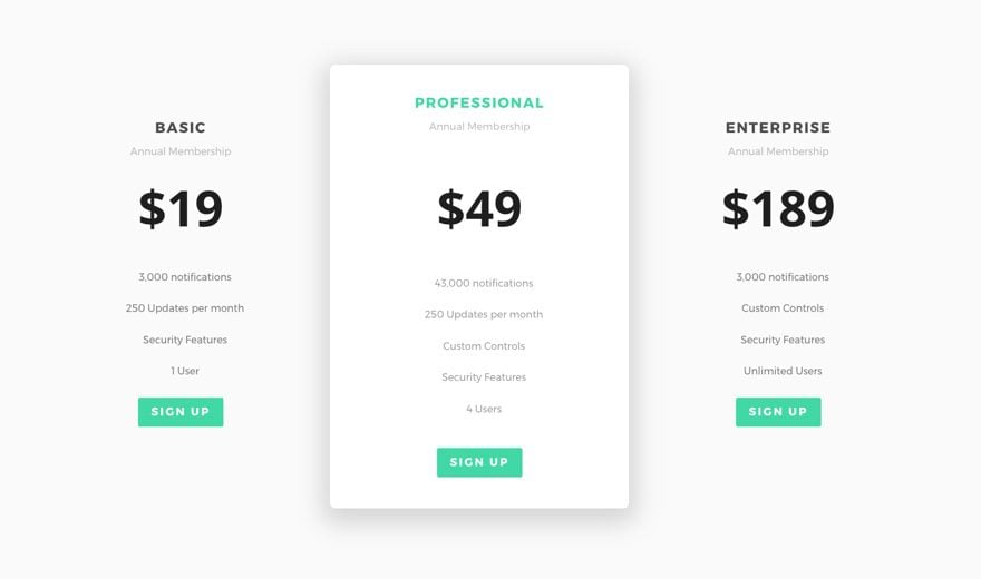
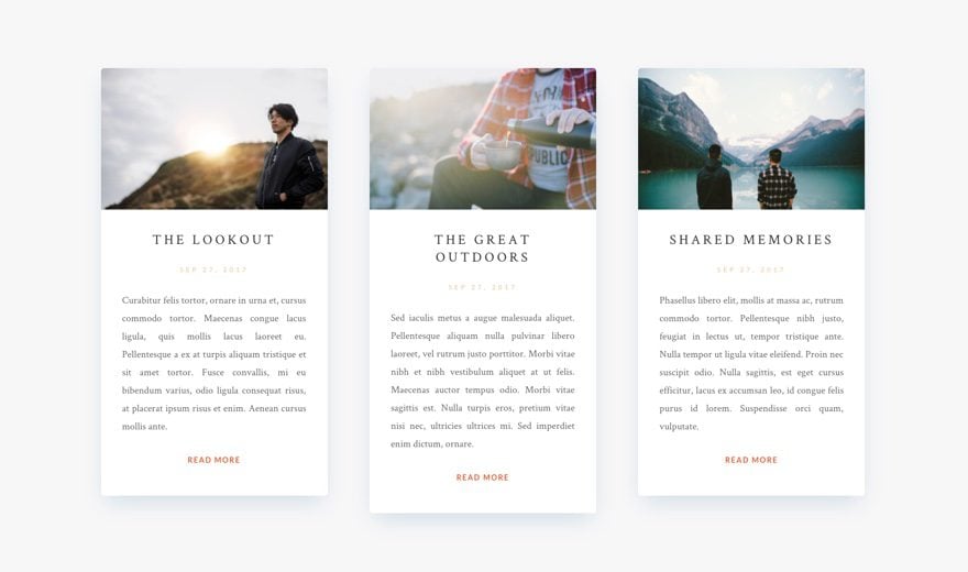
There are so many fun ways that you can use box shadows to bring your designs to life. Add box shadows to button modules to make them stand out, add box shadows to images to help give depth to your design or even add shadows to entire sections to add that extra bit of separation.
Our team has been having a blast experimenting with these fun new controls, and we know that you will too. Just take a look at some of the amazing designs our team was able to build using these new features.
The new box shadow options are available today, so download Divi and take them for a spin. Let us know what you think in the comments and don’t forget to check back next week for even more great Divi features coming your way.
Get 10% Off Today!
Today's The Best Day To Get Divi Or Upgrade Your Account To Lifetime
Join the most enthusiastic and loving WordPress theme community on the web and download Divi today. Using the new Visual Builder, you can build websites faster than ever before with its incredibly fast and intuitive visual interface. You have to see it to believe it!
Join Today For 10% OFF!Renew Your Account Today For 10% OFF!Upgrade Your Account Today For 10% OFF!

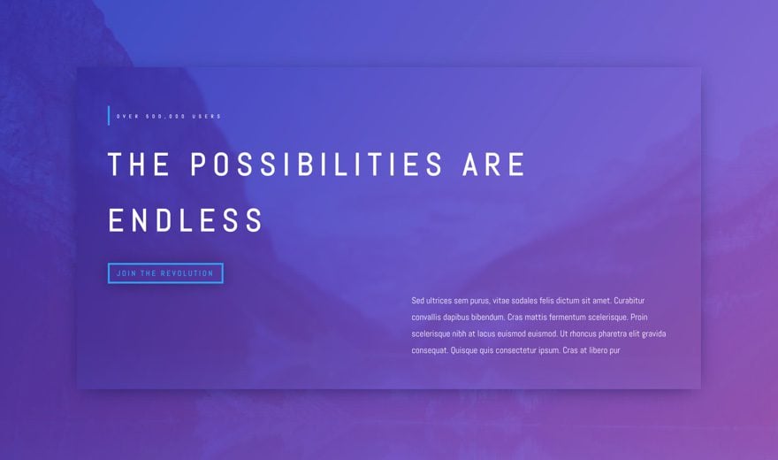
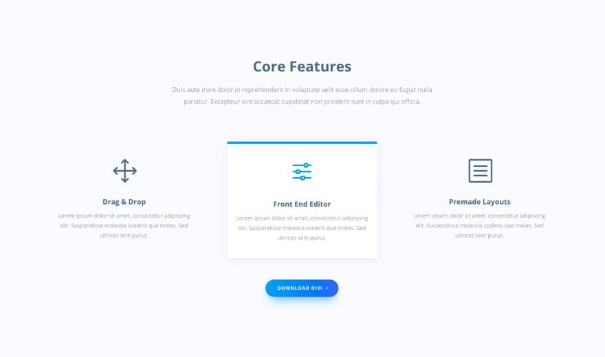




I made a Button using the Box-Shadow Feature.
Now I want to alter the Box-Shadow for the hover-state, is that somehow possible?
-> I want the box shadow to be removed, to have the feeling of a physical button being pushed.
I love this! Shadows for everything! Only problem I’ve come across is no drop shadow for a column. Need more column specific updates in the next round. You guys are awesome. Keep doing you and making us all very happy people.
Great work, does this work as a text-shadow option as well, ive been manually doing this for a long time and would love to see the same but for text. Thanks.
I started implementing shadows right away. As usual, you guys are flawless. Now all my buttons (among other elements), leap right off the page.
How can i activate box shadows? I dont see this option in any modules..
I definitely have to say that I love the new features that you guys have implemented. Such a time saver! Thanks for the update.
Well done, ET!
I must say, IT’S ABOUT TIME a major voice in the industry began moving away from that irritating and off-base FLAT DESIGN (said with a tone of disgust) fad that has been infesting websites over the last decade, making it difficult to distinguish elements of a site, and in many cases, downright ugly. Sure, some flat design is well-done, but not much, and I’m hugely tickled to see trends finally moving away from it.
Now that these wonderful box shadows are easier in Divi, might I suggest a next step to be doing the same for BORDERS? Style, color, size, etc.?
Again, well-done, ET.
Thank you, David. We are working on that! ?
This is great!
But how can I apply box shadow to all buttons as default?
Where can I download DEmo8 layout please
Awesome update with the drop shaddow. Still waiting to see text and other hover over affects on images. Please!
+1
Thank you ET! Keep the flame up!
An idea I had which perhaps you guys could consider is in the backend editor when you click an element to edit instead of going into that element the editor window popups the same as visual editor and the element you are editing changes color. That way it is easy to see which element you are editing and you then only have to maintain a single editor interface. It would be very useful to have the toggles and search in the backend editing as the number of options available is getting larger and larger.
Whether or not this is technically feasible I’ll leave that up to you guys to work out 😉
Looks nice however, when I tested on one image I just can’t get the shadow on that image. The shadow appears to being applied to the row instead 🙁 I have cleared cache etc.
Sorry for the trouble, Adam. We are aware of this and the team is looking into it. A fix should be available soon.
Nice ….very nice and easy to use for my customers. But adding alt-tags (important for SEO) has been moved to the advanced tab (?) so more or less hidden.
Can you please pay attention to this subject? When uploading an image with a proper optimized name and the plugin “Format Media Titles” of David Gwyer is an alt-tag automatically added in the media library. So why not use this data for the default alt-tag in the image block? This makes building an optimized site a bit
easier.
Thanks!
Cheers
Peter
cool feature.. thanks
That’s great, but as others have said; you should be able to set this in a global manner via the module customizer. I’ll stick with hand-coded CSS and custom classes until there’s a reliable, easy to use, global method within Divi itself.
Also, are there plans on adding responsive images for the different break points, regular displays and retina displays? This is one thing that’s really lacking and becoming more and more necessary for modern websites…
+1 for global settings (and individual on a module/row/column/section need basis)
Nice feature! I really like that you can use the shadow effect to create a slightly off-sync “box” behind images, without the fuzz with background color and negative margins.
I am unable to comment on previous posts, due to the comments being “closed”. So, I’d just like to awkwardly recommend that when posts regarding modifications get put up on the blog, to state a disclaimer that it doesn’t work on mobile. Especially since Google penalize sites that aren’t mobile optimized. Many of the posts in the last couple of months have suggested some amazing edits and customizations, but fail when it comes to tablet/mobile devices. A quantity of posts over quality is not the best. I think we’d all prefer the opposed (quality over quantity). No one in 2017 should make any adjustments to their site that aren’t compatible for tablet/mobile devices.
Just some food for thought. A part from that, amazing job!
Would be great to get the ability to add these to Columns.
Sometimes you may want a blurb and a button inside the one shadow area for example and currently, that isn’t possible with this.
Overall – Id really like more column styling to be available in the builder.
Thank you, Matthew. We have future plans for better row and columns management and when that is ready, we will also include the Box Shadow controls. ?
Looking forward to this!
Agreed. Box shadow on columns would be an improvement. I regularly use small stacks of modules in a column, and this would set them apart very nicely.
I agree too! I was so excited, updated my version to find no shadow on columns.
This is a great addition to the theme. I was doing this for my own site and clients’ manually. The designs previews using the box shadows are also very well done. Good job guys.
Nice addition, but all images are now aligned to the left and ignoring previous setup details. How to fix it, please?
Sorry about that, Raf. We released an update with a fix that addresses that problem. Please update to the latest version (3.0.82).
Thanks Vlad. Updated to 3.0.82, now it seems to be working fine.
Wow! Divi keeps it coming…I use CSS to create these effects but there’s no need to now. Eventually there won’t be a need to do any CSS because of Divi lol. This is going to be a design battle for all the Divi users.
Divi is absolutely awesome!!!; there are lots of potentials; there is only one thing, all the headers are looks the same; will you guys work on more header styles, please!!!
ok, that’s it I’m hooked…
Really wonderful!
Thank so much for this new feature.
This is awesome! Is there a way to apply this shadow setting to the button within the CTA module?
You sure can! ? Go to the Call To Action module settings then to Design > Button, enable “Use Custom Styles for Button” and scroll down to “Use Custom Styles for Button”.
I found it! That’s perfect – what a GREAT update! I also appreciate your presence, Vlad, in the Facebook user groups.
Great job.
There is a small unimportant error in the Extra changelog.txt file, where the version jumps from 2.0.80 to 3.0.81. Same DIVI version number to Extra. The automatic web update is OK to 2.0.81.
Sorry for the confusion, Enrique. We identified two problems so there was a new update to address these.
Unbelievable!!
The addition of this box shadow facility invites enhanced design.
Go ET!
keep up the good work, you guys are doing an awesome work that we should thankful to Elegant theme staff. i am waiting for a Divi slider updat with more effects like multi layer animation in the slider
RESPONSIVE IMAGES, WHERE TF ART THOU??????????????
+1
Hola
Os escribo desde España
estoy comenzando a trabajar con WordPress y recomiendan muchos profesionales el uso de constructores como DIVI o Visual Componser.
Mi pregunta es que diferencias existen entre ambos?
Gracias
Pascual’s posting above says:
=============================
Hello
I write from Spain
I’m starting to work with WordPress and many professionals recommend the use of builders like DIVI or Visual Componser.
My question is, what are the differences between the two?
Thank you
Puede publicar su pregunta en inglés escribiéndola primero en el traductor en https://translate.google.com.
Ahí es donde hice esta traducción al español. Espero que esto ayude.
Guys, you kill everything ! Thanks for us, the little (happy) users of Divi !
Hay by any chance can we download those layouts?
Very nice, but it seems you can only access the box shadow feature via the Visual Builder, is that correct?
I very rarely use this, am I the only one?
They are also available in the Backend Builder. In the Design Tab, scroll all the way down to “Box Shadow”. ?
Oh yes, sorry, I didn’t realise there had been yet another update, I presumed the one I applied this morning included this new feature!
Box shadow options exist in the back end builder as well 🙂
Thanks, this is gonna be a real time saver!
Is there an option to show/hide the box shadows on hover? This important option is missing from the recently released animation update where it would be very useful, and it would be very useful now in the box shadow update as well.
This is something we are working on 🙂 Hover transitions for all Divi Builder settings is in the works!
GREAT – exactly what I was missing! Thank-you!
While you’re at it, you could possibly add the possibility of adding css for different states (:hover, :active, :focus etc.) in the advanced tab. 🙂
Seriously? Wow! This is awesome!
I’m in love ❤️ Thank you ??
Great update!
Thank you!
Great feature which I will definitely be using but I wonder (British understatement) if you could spend just a little time fixing really irritating things like the no scrolling editor bar in the back end and the crappy forms handling mentioned by someone else. Is there a strategic reason for deliberately ignoring issues like this that affect developers ? I am sure others could mention their own pet irritations too.
A bit of honesty why these issues don’t get addressed would not go amiss.
Can this be set differently for mobile / desktop etc. It would be good to be able to disable them entirely for mobile and the same applies to the animations.
Great suggestion, Peter. Having more control for different cursor states and devices is something we are addressing holistically.
Another item to strikethrough on my wishlist. Cheers people.
You guys are unstoppable! Keep it up! Awesome!
Hallo,
one word GREAT
Sweet!
Easy with CSS, easier with Divi…I like it that way!
How about :hover built into all the Divi options? Line spacing, box shadows, transitions…
This is something we are working on as we speak 😉
Kenny,
I am so glad! I always wanted to be able to do this in the CSS tab, but can’t and so I use custom CSS in theme options. I’m very excited to hear this! Any estimate on a release date?
Easy with CSS, easier with Divi…I like it that way!
How about :hover built into all the Divi options? Line spacing, box shadows, transitions…
+1 for on-mouse hover options
Please sort out the breakpoints as there needs to be one for mobile portrait and another for landscape. Also ideally another set for small and large desktops.
Also please fix the styles for Extra as the desktop breakpoint of 1024 doesn’t match the 980 as used by the page builder. Also for Extra to add the global color palette setting in options and the mobile and tablet settings in the customizer the same as in Divi.
Thanks.
Peter’s comment above brings up a point that’s been on my mind for a year or more, the problem of display sizes ranging from 4k super-huge (I use a 4kHDTV as a display in my office) to smartphones.
I agree it’s a superb idea to design your interactive live screen in pixels, so you can have super-fine-grain control over how things look, but with many of these settings – such as these shadow tools, wouldn’t it be better to (a) have Divi automatically sense the size of the current display window (being used for the design work), then (b) when the designer clicks OK to save the changes, to have Divi convert the pixel measurements to percent? Probably percent of the current window height/width? That way, when the screen is displayed in a different size window, the dimension proportions would remain constant. There would have to be, of course, an added in minimum and maximum, to prevent effects disappearing or taking over.
Just a thought.
Excellent. You’ll just need to add the After Hoover effect. Thanks ET.
A few companies have been sending me emails to do surveys. They are usually companies that have hit a brick wall and the survey is a desperate attempt in finding ways to improve their product. Near the end of the survey they always ask for suggestions to improve their product. I always use ET as an example of a company that blows my mind every week with innovative, cool factor features and tools. ET is the gold standard of a company who strives to make a great product even better without needing to tinker with payment plans.
I agree with Captain Jack. The number one reason I jumped into Divi instead of one of your competitors is the lifetime license availability.
Since then, I have been impressed and pleased with the continued advancements and upgrades.
Another great feature! I’ve been using custom css to style my blog posts to have a box shadow around the text area to make the blog post pop and easier to read.
The blog post is a template I saved and can re-use for all my posts.
This makes it easy and clean to implement box shadows on any module without having to write custom CSS code!
Really appreciate all the latest additions to the DIVI theme!
I was hoping more for the font update, but I will take this as well.
I’m viewing this on a MacBook Pro and the demos aren’t working. Each of the images are full screen without being able to see the box shadows and the button demo isn’t working at all.
The continued development and improvement of Divi is great. Appreciate your commitment to continual improvement!
Can we get this in the Theme Customizer so we can make all images, or all blurbs, or whatever have a consistent design site-wide? Seems like the Theme Customizer has been ignored of late.
Same with headings (h1-h6) – in theme customizer to apply to whole site globally.
Concur. This would be a very welcome upgrade.
fabulous new feature and concur that it will be great to have this inside the Theme Customizer
Good observation, I concur.
Very grateful for all the terrific new features, and agree this would also be a wonderful and welcome addition.
That’s slick. Very nice improvement. Was doing this manually before. Can we add or edit the shadows for Hover effects?
Another great addition.
Onwards and upwards guys 🙂
Thank you, thank you, thank you! God bless you.
This is great fun! It’s a bit like getting a surprise gift every week or so!
Can I also suggest that, if unusual results occur, try deleting any cached and minified css or javascript files first.
Another DIVI home run!!!!!!!!!!!!
Absolutely awesome! You guys have been rolling out so many amazing new features lately! So proud to be a Divi supporter and fan.
I don’t think you’ve checked this in Safari. I’m currently running Version 11.0 (11604.1.38.1.7) and the demo page is all over the place.
Awsome, thanks for adding this unique feature on Divi Builder, it will help me a lot to give shadows to the boxes indeed. If possible please add some header styles as well because Divi has very limited options when we are talking about the header styles.
Best of Luck 🙂
Thank You.
+1
+1 for the header styles; really need something different please!!!
Great feature! Thanks for y’all’s hard work!
Yes! This is gorgeous! Thank you very much, Divi theme for such hard work and new updates! You really have the best product on the market!
Another awesome update. Love these new feature updates.
There is a problem with the images after this update, they are not aligned in the center, but to the left, how can i fix this? The Image Alignment section is not working
This has been fixed in the latest version. Sorry again for the trouble!
that was fast! thanks a lot ET Team, you guys rock!
Nice try, but now instead of the image, it shadows the whole module width rather than just the image as it was doing when it forced the image to the left of the module.
If that was the intent, OK, but of limited utility. On the Call to Action there are two Box Shadow choices, one for the button and one for the whole module, like what is now occurring in the image.
It appears to be on all images — just tried the one in the People module — to the width. Probably I am doing something wrong.
Sorry for the trouble, Alex. We are looking into this issue as we speak.
Have you tried deleting cache and any minified CSS/Javascript?
You guys are amazing and you keep blowing my mind with the features you’re releasing. I’ve only told a few people this, but I believe Divi helps WordPress stay competitive with the likes of Squarespace et al.
You have turned building websites into a dance.
Hi Nick,
Looks great. Recently was adding shadows under images the manual css way. This just make this one step easier.
When are we going to see major structural additions though such as.
Custom post type integrations. Oh, and you need to re-think how global layouts (not just global modules, rows and sections) work for this to really work.
hooks for pre header, after header, pre content, pre footer etc..
The ability to have the contact form send the title of the post from where it was sent in the notification email and in addition to this proper html formatting for the email. I recently had to use contact form 7 to do this and styling was a complete nightmare. Would have preferred to have just used the Divi contact module.
So basically all I am asking for is Divi 4 ; )
Thumbs-up and +1 to this input.
Thank you for your feedback, Stephen!
We are working on a future update for custom post type management which will basically allow you to enable the Divi Builder on custom post types. We also plan to add new hooks in the Developer update.
As for the contact form improvement you mentioned, we don’t have anything planet at the moment, however, I will definitely forward it to our product team. ?